If you’re looking to create the best-looking, most effective infographic, you’ve landed on the right page. With 100+ stunning infographic examples from around the world, this blog post has got all the inspiration you need to create designs that can knock the socks off your readers and link prospects alike.
John Rushing on drawing inspiration from other designers’ work:
It’s completely essential to the design process. Competent design must draw on an awareness of previous models. This is not the same thing as copying those models.
You can make tons of different types of infographics, depending on the kind of information you have and your target audience. We’ve divided our collection into 11 categories so you can jump to the type of infographic you want and behold the best of the samples to inspire your designs. No matter what kind of content you have, you will find a similar infographic example from this list to get your creative juices flowing.
List Infographics
This type of infographic is typically used to list benefits, tips, tactics, or different ways to do something. Whenever you have a list of items, some tips, an ultimate guide, or something similar that you’d like to break down into a more digestible format, this is the format to choose.
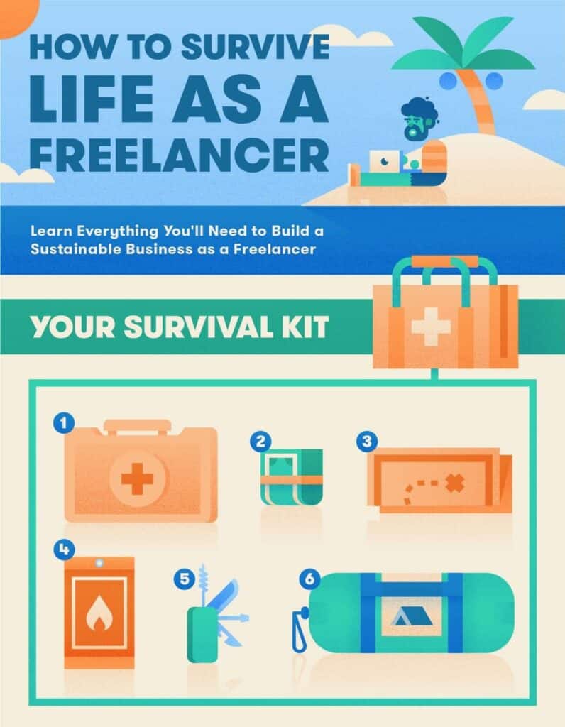
1. Survival Guide for Freelancers
This infographic from Fundera has nailed many elements of an impressive infographic. For starters, they have a clear title in an easy-to-read font. There’s a balance between white space, info, and graphics, making that information clean and not overwhelming. The tips throughout are actionable and unique, adding real value to the visual.
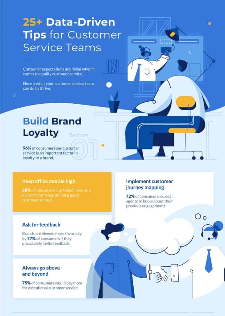
2. Data-Driven Tips for Customer Service Teams
Nextiva has stuck to a simple palette for this infographic, making it look clean and easy to navigate. The illustrations are engaging and fun, balancing the rigidity that can be associated with data. Actionable tips are in bold font, and each tip is supported by relevant data and to-the-point text.
3. Mortgage Checklist
The beauty of this infographic lies in its simplicity and relevancy to the target audience, i.e., people interested in buying a home. A descriptive subtitle sets the theme effectively, and the simple design matches the purpose of the infographic, i.e., making the loan acquisition simple.
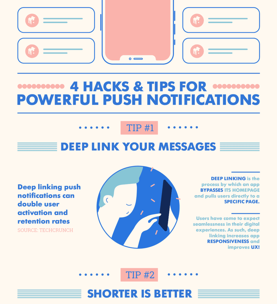
4. Powerful Push Notifications
It’s another simple infographic with a soft and simple palette and excellent use of white space. Notice that each tip has at least one data element to support the claim, and the source is mentioned right there to strengthen the credibility further.
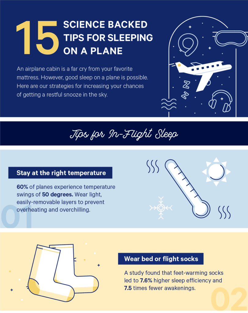
5. How to Sleep on a Plane
Right off the bat, we can notice two things in this infographic—Casper’s brand colors and typography. The soft palette and simple illustrations are successful in making this infographic look dreamy.
The title entices the readers that they’re going to get credible tips. Each tip is short, actionable, and prominent. It catches the eye right away. As promised, all the tips are supported by relevant researches and studies. This infographic has earned Casper 32 backlinks from 24 referring domains.
6. Stress Acne
Soft colors work very well for the beauty niche. The title is on-topic and clearly sets the right intention for the infographic. The best thing about this infographic is that each tip is accompanied by relevant information and a remedy. This infographic has attracted 65 backlinks from 29 unique referring domains till now.
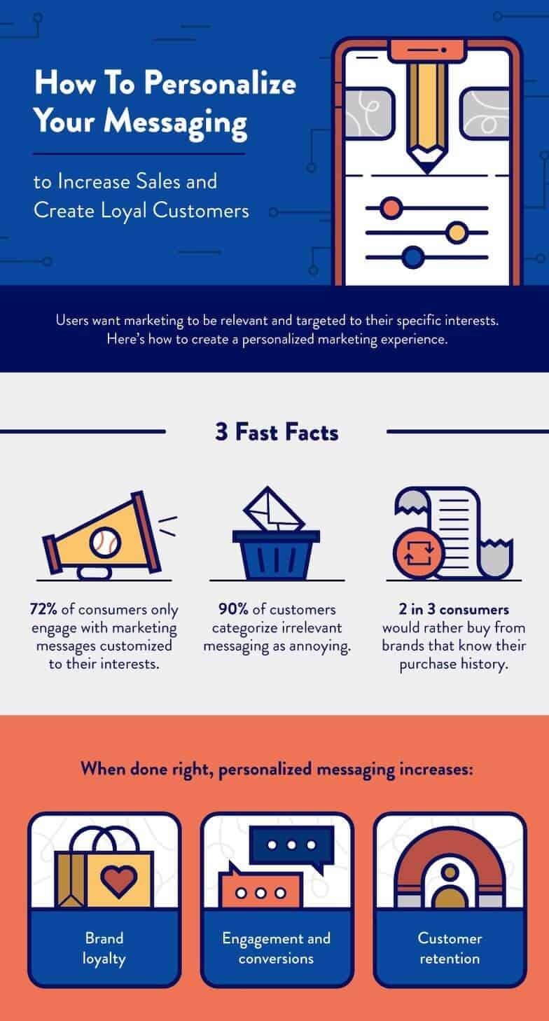
7. How to Personalize Your Messaging
This infographic by Clever Tap is a mini-guide that not only presents the tips for personalizing the messaging but also informs the readers why they should do it. The superpower of this infographic is the actionable content, in short, simple sentences, within a structured layout.
There are data and benefits to bolster the importance of personalization in messaging and the tips themselves are further categorized into clearly labeled sections. This impressive infographic has been linked 58 times by 49 referring domains.
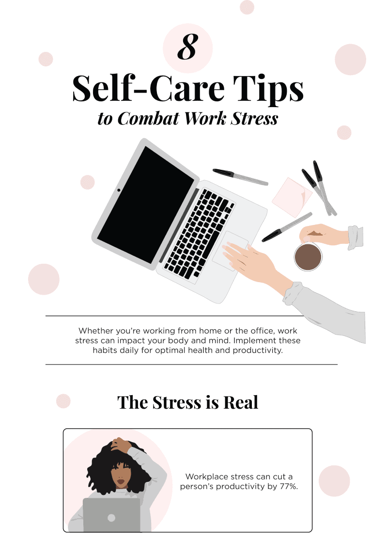
8. Self Care Tips
This infographic has a soft palette in warm tones. It’s simple and delivers what it promises in the title. Each tip is kept short to keep the focus on the quotes from busy people, which is the highlight of this infographic. There’s a quick explanation for each tip to summarize it perfectly. It’s a relatively new infographic but has already been linked by 11 referring domains.
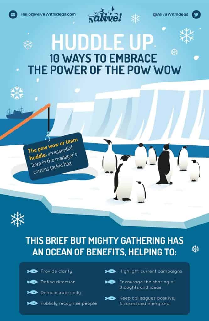
9. Huddle Up
What an engaging infographic as it uses an analogy with cute penguins. The play on words not only engages the audience but also adds a fun element to an otherwise dry topic. This infographic has utilized contrasting colors to its advantage with perfection. Each actionable tip is further explained, but the text is kept short, direct, and to the point.
Geographical Infographics
When you’re creating an infographic with data or info related to different areas of the world, a country or a city, geographical infographics are the best match. Here are a few of the best ones for your inspiration.
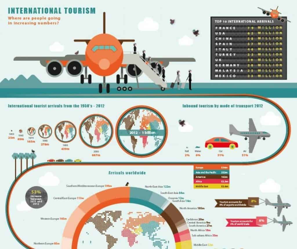
10. International Tourism
This infographic uses quite a few elements to represent all the data effectively. For the most part, the data is color-coded for different parts of the world with just the right amount of text to explain them. However, the fair amount of white space and a uniform background color prevents it from looking too busy.
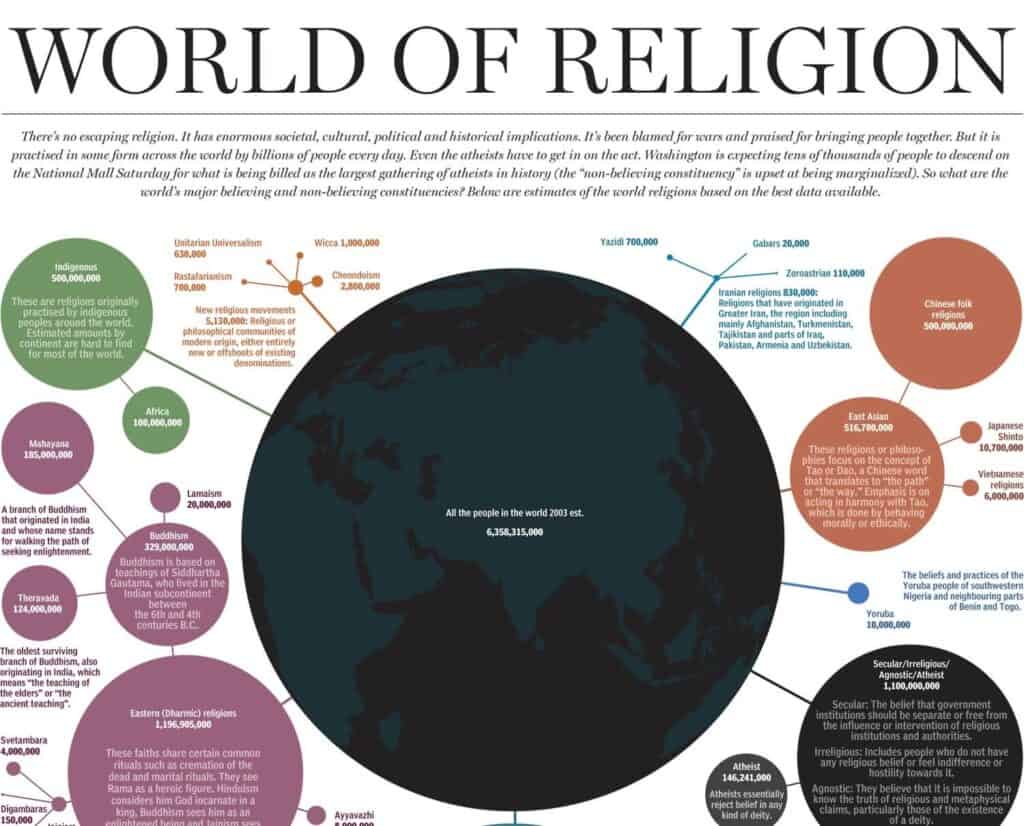
11. World of Religion
This infographic has a lot of information packed into it. We get all the vital introductory information about the religions required to get an idea about and compare different religions. Though it may seem like there are too many words than a typical infographic should have; however, when we consider the enormity of the task and the simplicity in which it has been conveyed, it’s pretty impressive.
The size of circles offers a visual comparison of different religions in a bird’s eye view, and the color-coding really makes it easier to make comparisons. The infographic has attracted 29 backlinks from 14 referring domains so far.
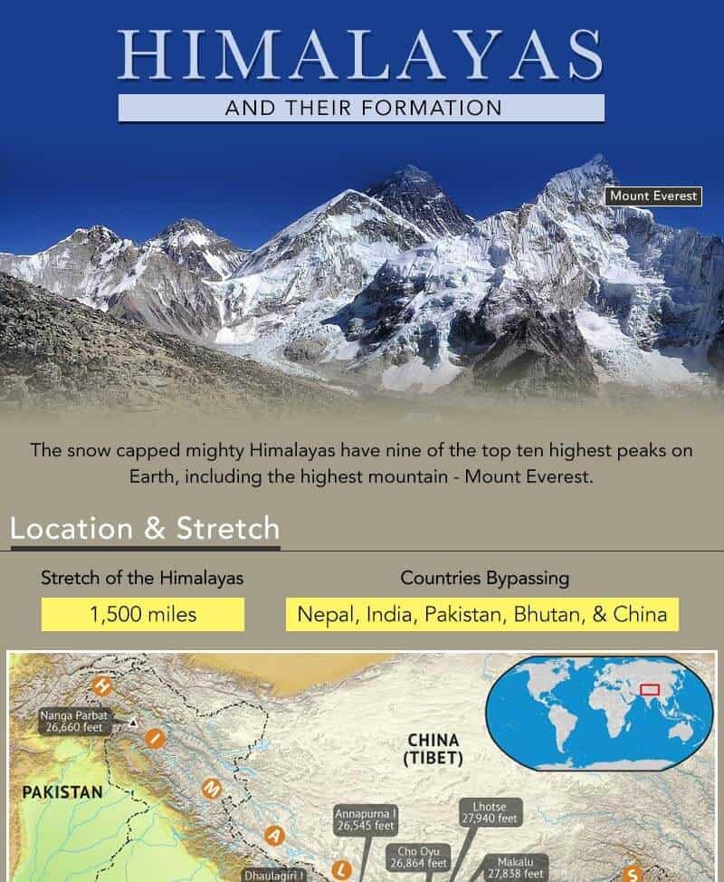
12. How Were the Himalayas Formed
This is an infographic that uses real pictures in combination with illustrations. It is an excellent example of an infographic simplifying a complex technical concept. The visual aspects are perfectly complemented by the text explanations, which are short and on-point. The plain background for most of the infographic makes the text and the visuals pop.
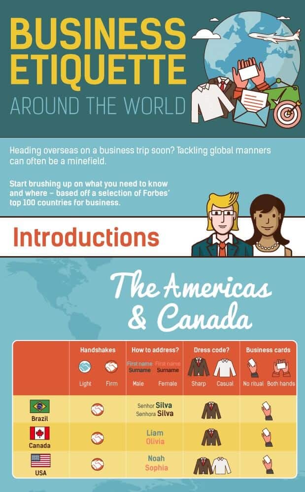
13. Business Etiquettes Around the World
Contrasting warm shades against the cool background make the tables prominent and draw the eye. Various icons are used to convey repetitive information without boring the audience. The structured sections improve the scanability of this infographic so that the readers can jump to the countries and the type of information they’re curious about. Text is minimal and to the point. This infographic has attracted a whopping 107 backlinks from 60 referring domains.
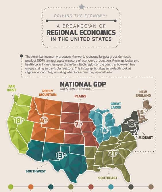
14. A Breakdown of Regional Economies in The US
This is another infographic that uses icons and minimal text to simplify the information and facilitate points of comparison among different regions. Color coding is also implemented to make it easier for readers to relate the information to the locations of different regions on the map.
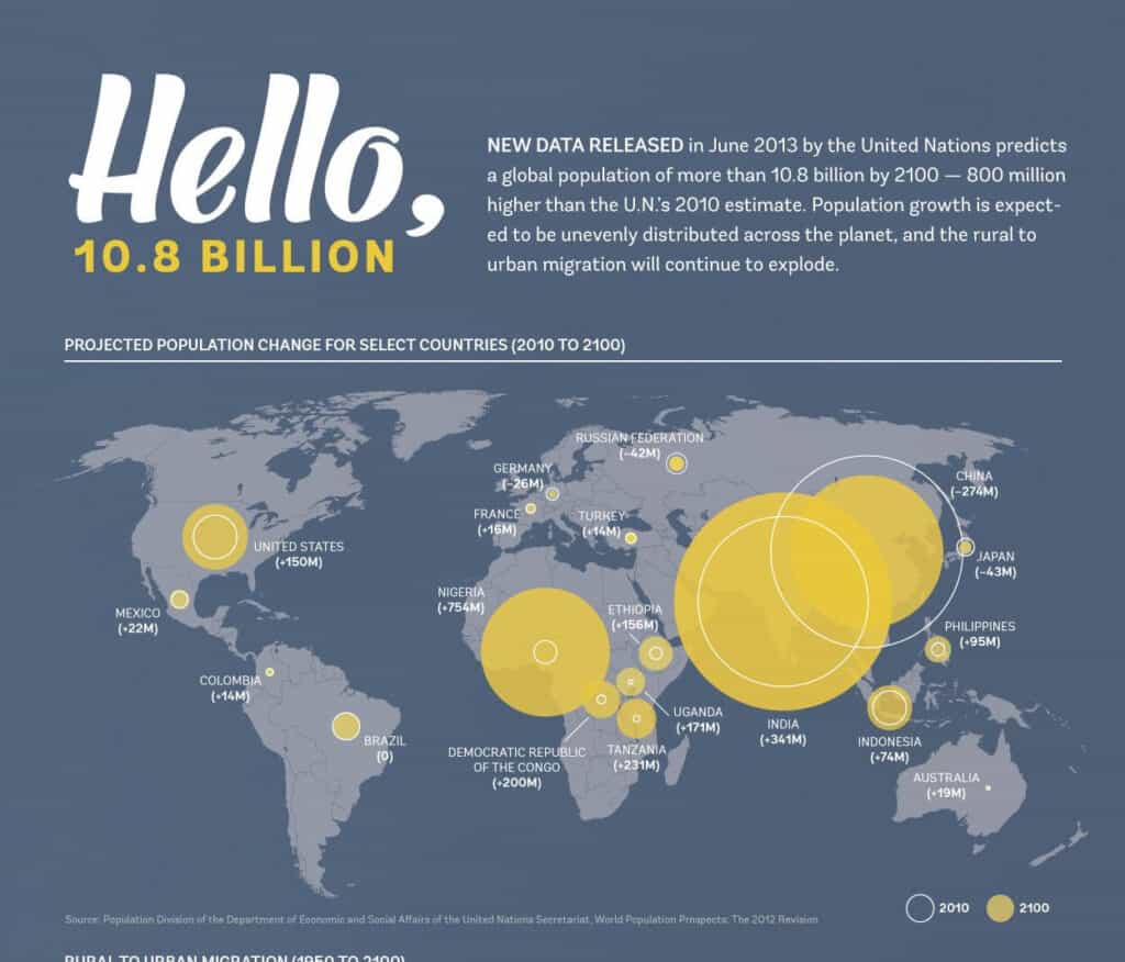
15. Global Population in 2100
Here’s another excellent example of an infographic that uses photos and illustrations to drive the message home. Using a minimal palette, this infographic extrapolates historical data to predict the population in the next century and depicts it through visual comparisons as well. This infographic has been linked 218 times and counting.
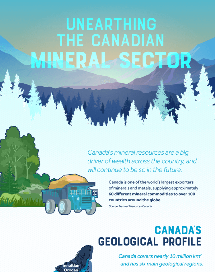
16. Unearthing The Canadian Mineral Sector
It’s an elegant, well-balanced infographic that uses a colorful palette without giving off a busy look. Studies conclude that 55% of readers prefer information presented in vibrant colors instead of neutrals. The text is on-point and highlights the important inferences and data points. Simple data visualizations are reinforced on maps to compare and contrast the mineral production across different provinces and territories.
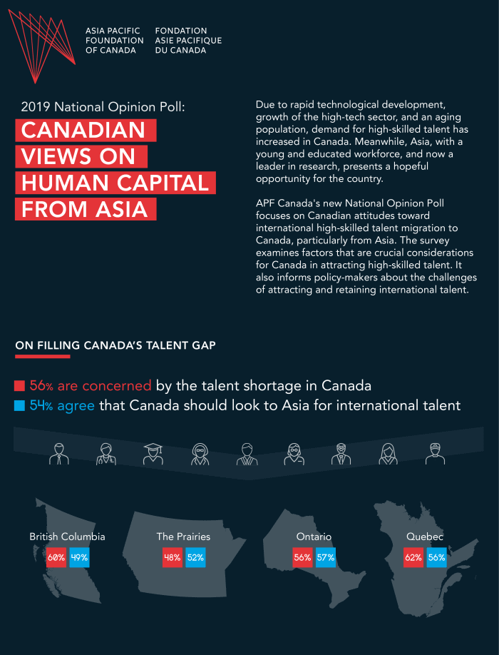
17. Canadian Views on Human Capital from Asia
The balanced use of text and data visualizations makes this infographic stand out. Captions and paragraphs are strategically used to highlight important statistics and provide context for the data. This infographic makes excellent use of the dark background without trying to balance it out with lighter shades.
Instead, it uses contrasting red and its shades to highlight information and complement it with the whites and blues. You can find various small visual elements along with data visualizations reinforced on the maps to paint a comparative picture.
Comparison Infographics
When your audience is in the consideration stage, comparison infographics can provide a quick and simple way to clarify similarities and differences. That’s why people love comparison infographics and here are a few of the best of them.
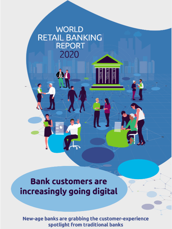
18. World Retail Banking Report
This infographic packs a lot of information and compares the new-age digital banking to traditional banks in many different ways. On-point text is used to highlight information, and statistics keep the content engaging and informative. This infographic has been linked 46 times from 32 referring domains.
19. Sales Vs. Marketing
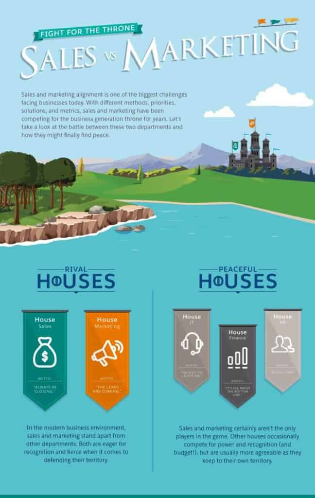
Even if you don’t understand the Game of Thrones reference here (why won’t you, though?), it’s a cool infographic with a fun vibe and engaging visuals. Text is in the form of storytelling that helps the information flow and keeps the reader engaged. This is a perfect example of how infographics can take a bland comparison and turn it into a resource everyone would love and share.
20. Online Course Comparison
This infographic compares three different platforms where you can host your online course. It uses minimal text, easy-to-understand visual elements, and color-coding so that you can notice the bigger picture in one glance. We can see distinct sections based on the comparison features.
21. Amazon Vs. Netflix
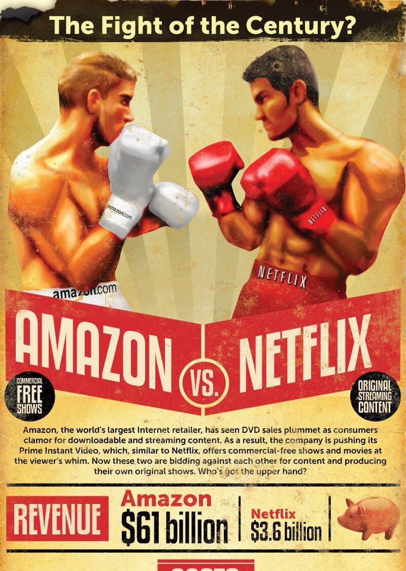
This vintage-inspired infographic has a rustic look, complemented by a minimal palette, showing how far back the competition goes. It has been linked 26 times and has 15 referring domains. The infographic itself is simple, with structured sections comparing different features such as revenue, audience, price, etc. This visual is packed with information about the two brands and how they compare. Text is used strategically with data to highlight important points of comparison.
22. Digital Marketing Vs. Traditional Marketing
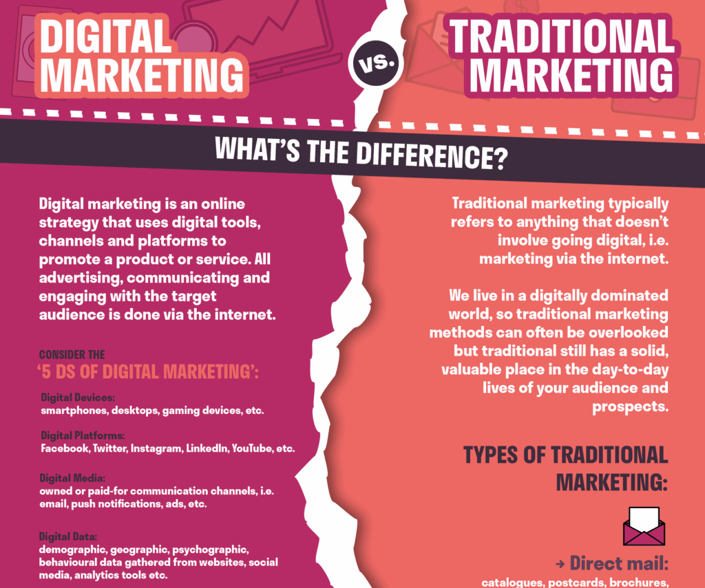
It’s an excellent example of an infographic with few visuals and heavy dependence on text. The text is short and to the point. It’s written in simple boxes and stylized spaces to highlight the text and draw the eye. This infographic utilizes every element to highlight essential points from colors to typography and text case. This kind of infographic works best here because both marketing methods don’t have a direct comparison.
23. Black Friday Vs. Cyber Monday
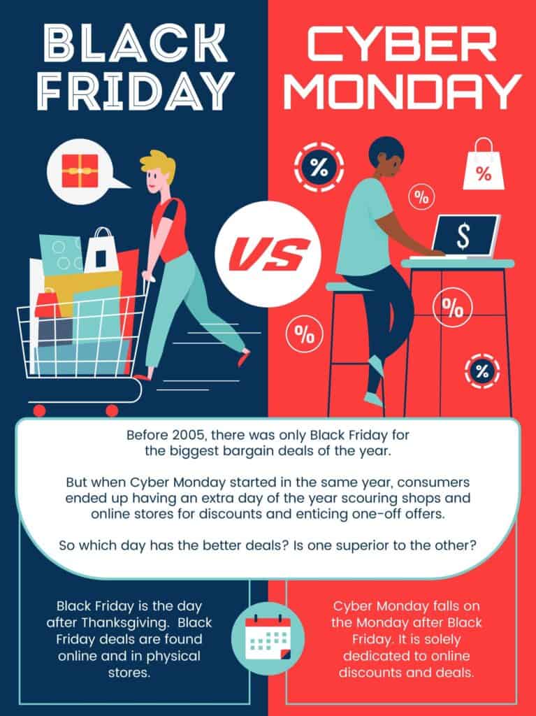
It’s a simple infographic using contrasting colors and a balanced amount of text and graphics. The infographic briefly describes both events, followed by side-by-side pros and cons for both. In the end are quick and handy tips to make the most out of these sales.
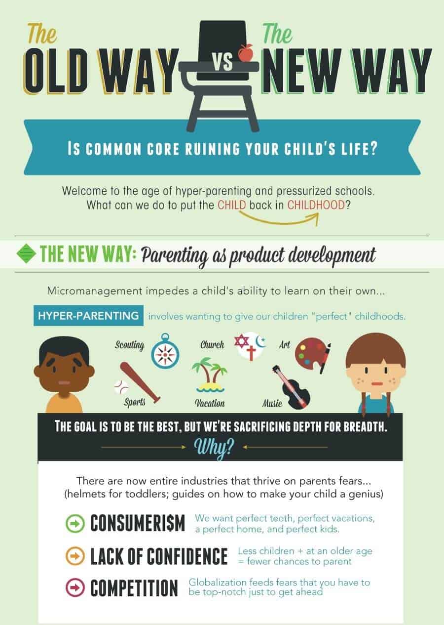
24. The Old Vs. The New Way
The title of this infographic not only fosters curiosity, but the topic also undertakes a very touchy subject for the target audience. Besides direct side-by-side comparison, this infographic explains the differences between the two approaches with the help of to-the-point explanations and examples. The use of simple icons and familiar illustrations also aids understanding.
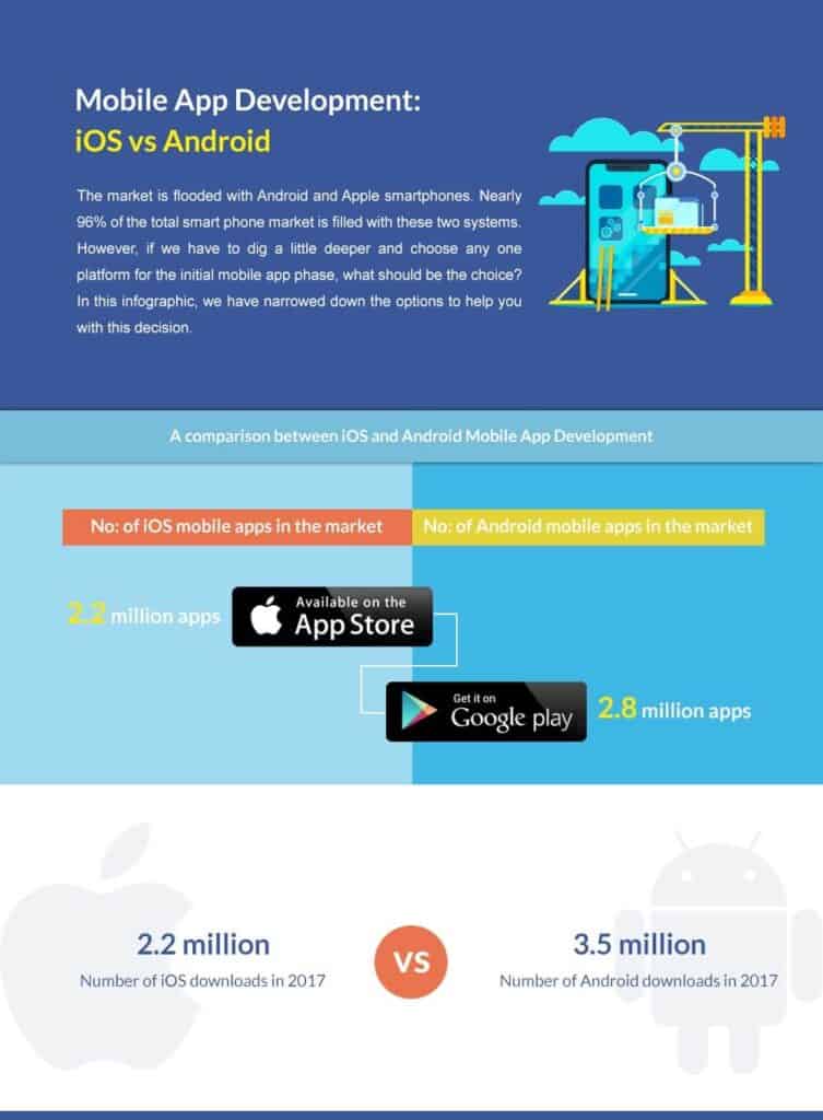
25. iOS Vs. Android
It’s a simple comparison infographic with plenty of white space to balance the colorful visual elements. We can see structured side-by-side comparison followed by just the right amount of detail about a few features of each platform. Even though it’s a technical topic, the text is easy-to-understand without any jargon so that the readers can understand which platform outshines the other and why.
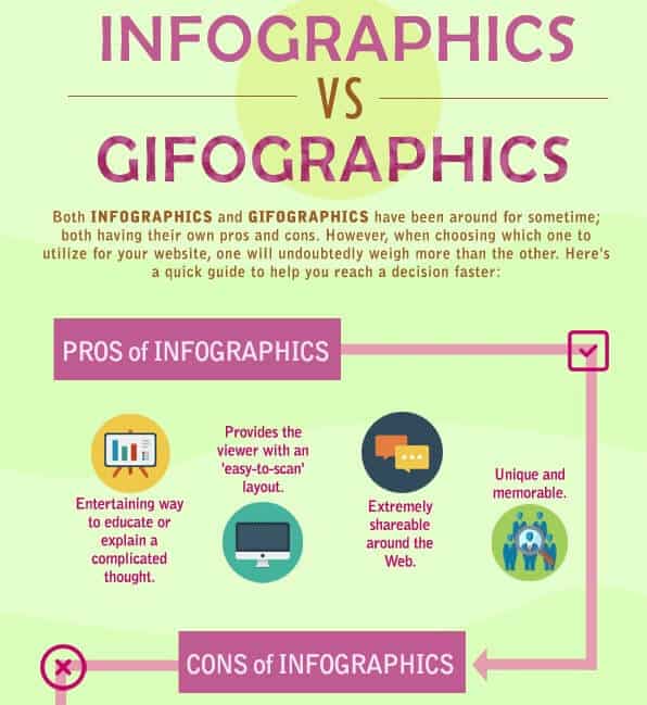
26. Infographics Vs. Gifographics
Warm tones in pastel shades are doing justice with this infographic. It’s short and to the point with simple graphics and easy to follow layout. The visuals and text pop against the light-colored background, and each illustration has relevant text for explanation. This infographic has been linked 15 times.
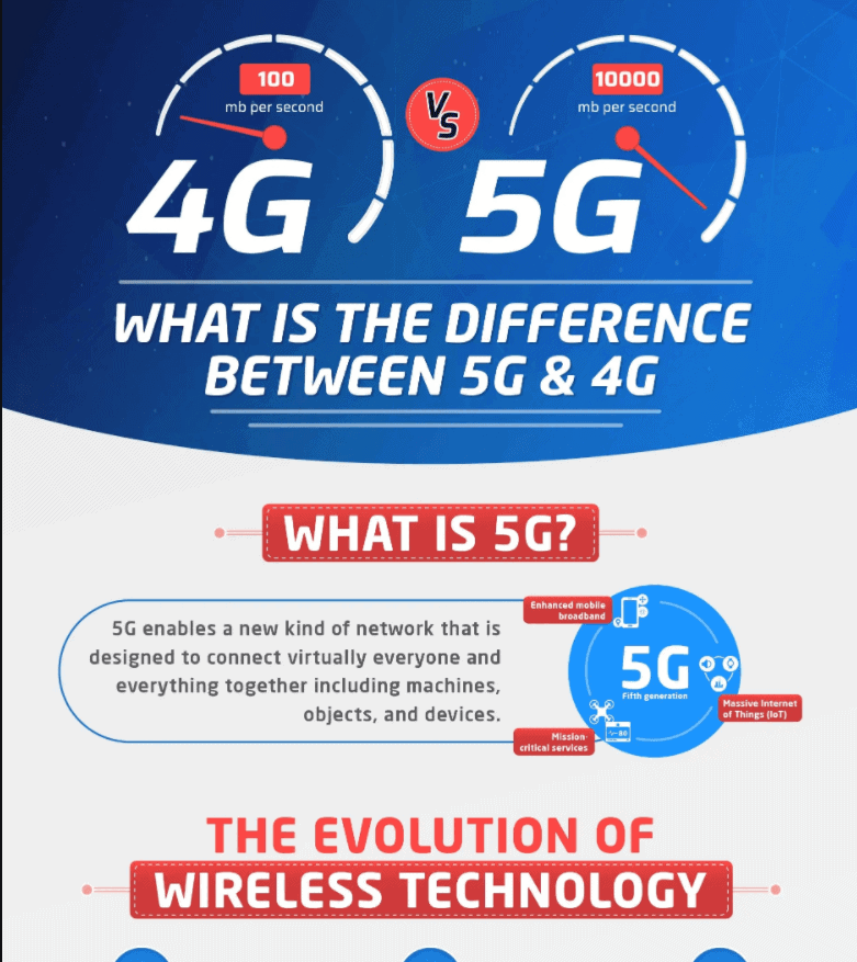
27. 4G Vs. 5G
This infographic uses a minimal palette of white, red and blue. The headers are prominent and descriptive so that the users can scan the info quickly. The evolution, the differences, and the pros and cons are all presented concisely with suitable, to-the-point explanations and engaging visuals. This infographic has 26 backlinks from 25 referring domains.
28. Millennials Vs. Gen Z
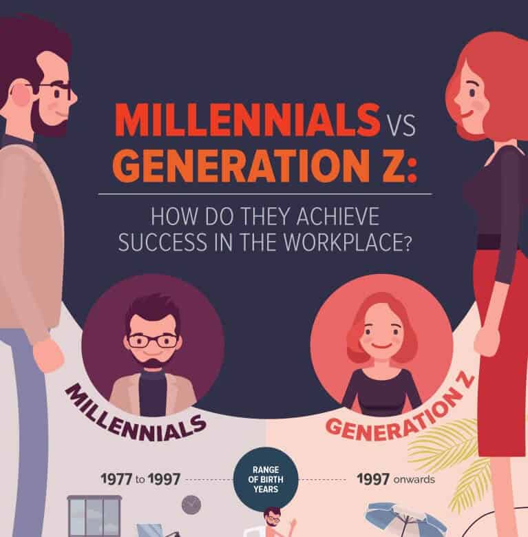
This infographic has earned 52 backlinks till now. It has a light, fun vibe with exciting visuals and short and to-the-point text explanations. The color palette is predominantly warm, with cool undertones for comparison. All in all, a sweet, short and clean infographic by Manila Recruitment on a topic interesting for their target audience, both recruiters and job seekers.
29. Printing Using Ink Vs. Toner
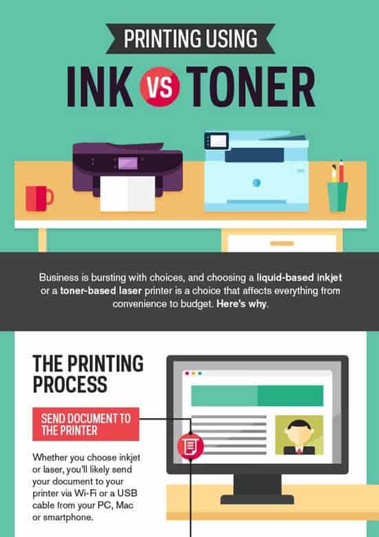
This infographic gives you more than a simple comparison of features. It’s jampacked with information and visuals that really aid the understanding without looking too busy. That’s because the infographic has a symmetrical design and different sections are easily discernable. Text is just the right length and relays all the crucial information in a concise manner.
30. Business Vs. Leisure Travel
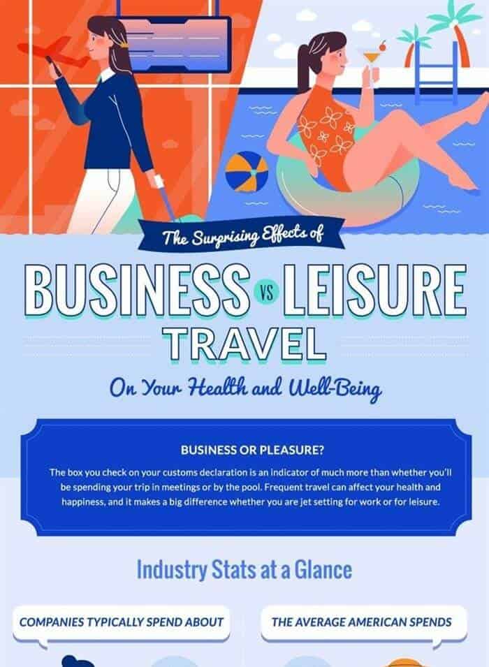
It’s a very detailed comparison between business and leisure travel, how much each costs, what it entails, how it feels, and how it affects our health and wellbeing. The infographic is balanced and symmetrical in design. The text details are on-point and supported by data and studies to bring credibility to all the claims.
Flowchart Infographics
Flowchart infographics are the best choice when you need to show various information streams or your information follows various logical sequences. They not only take out the complexity of the options but are also fun and engaging.
31. Do I Need An LLC?
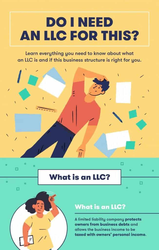
This infographic from Fundera has been linked 36 times with 16 referring domains. It holds all the information that a user might need to know and should consider before they decide to get an LLC. The flowchart is simple and color-coded, and the text is concise yet offers all the crucial points to help users reach a decision. The infographic also informs the readers about alternatives.
32. Find Your Perfect Wedding Scent
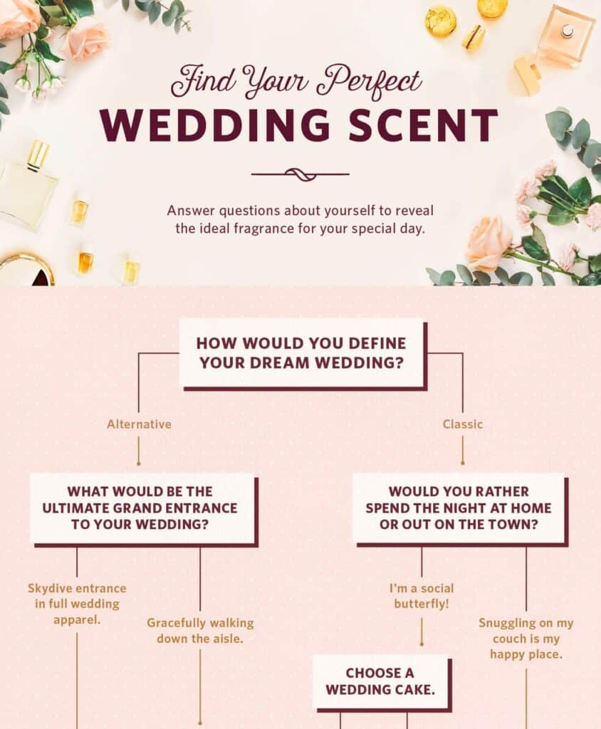
The title and subtitle set the stage for the flowchart effectively and grab the audience’s attention. It’s a simple infographic that does the job well in matching people with their Wedding Scent. Each heading asks the readers a question and prompts them to choose. The infographic also explains the unique properties of each scent in a concise way. The soft background ties the entire infographic together perfectly.
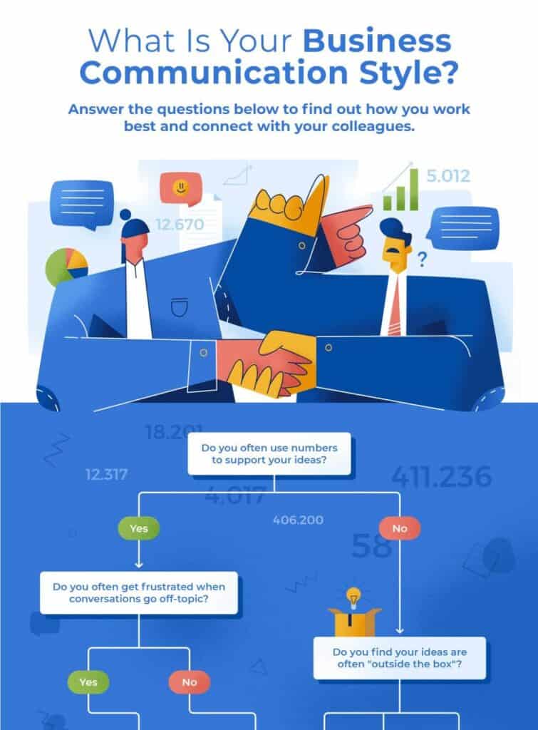
33. What Is Your Business Communication Style
This infographic has 61 referring domains and 150+ backlinks. In a few questions, it helps you identify your or your prospects’ communication styles. Then it explains each communication style briefly, along with quick tips on how you can use this information to your advantage. Prominent qualities of each type of communicator have also been highlighted for quick scanability.
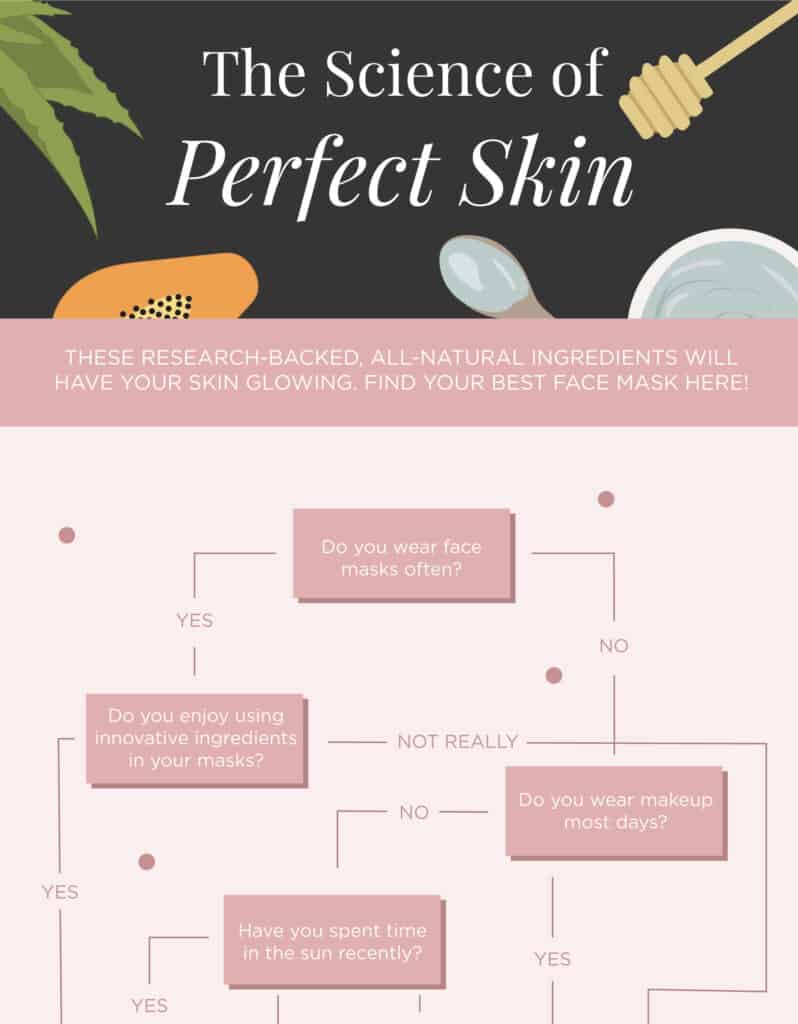
34. The Science of Perfect Skin
The soft tones of this infographic are on-brand for the Derm Review and perfect for the beauty niche as well. Once you discover your suitable mask, you can read all about it right within the infographic. As promised, you will know the science behind why a particular mask is effective in a simple no-jargon way. Finally, you also get the recipes to make your own masks. No wonder this infographic has been linked 21 times in just a few months.
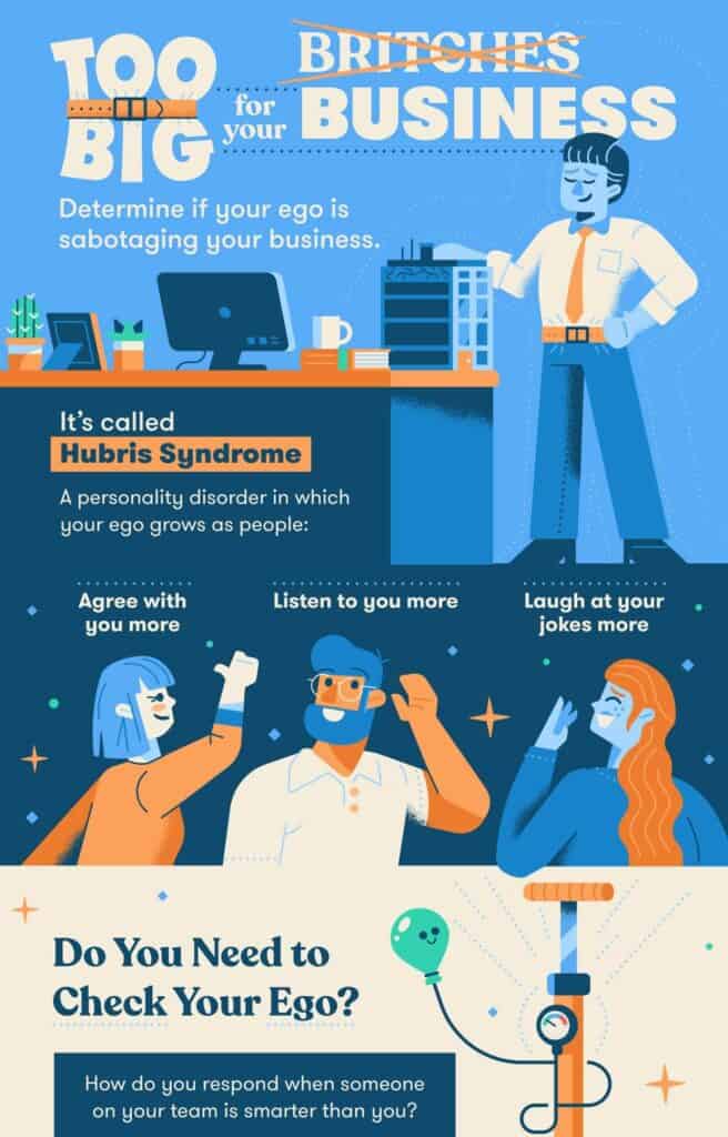
35. Too Big for Your Business
This infographic touches on a sensitive topic for people with an inflated ego. However, the soft colors, fun graphics, and their placement set a fun, light tone for the topic. The best thing about this infographic is the use of neutral words that set the stage for positivity. The readers don’t feel exposed or triggered by any of the questions in the flow chart. The use of data and to-the-point headings drive home the importance of checking an inflated ego and then empowers the reader with actionable tips to deflate their ego.
36. Are You a Good Boss
This is a colorful infographic but without being busy. It has 29 backlinks and 22 referring domains. You can spot different sections from their color-coded backgrounds and main headings. The flowchart not only leads readers to an answer but also helps them analyze their leadership style, strengths and weaknesses. In the end, it also relates quick, actionable tips for improvement and ongoing analysis of their role.
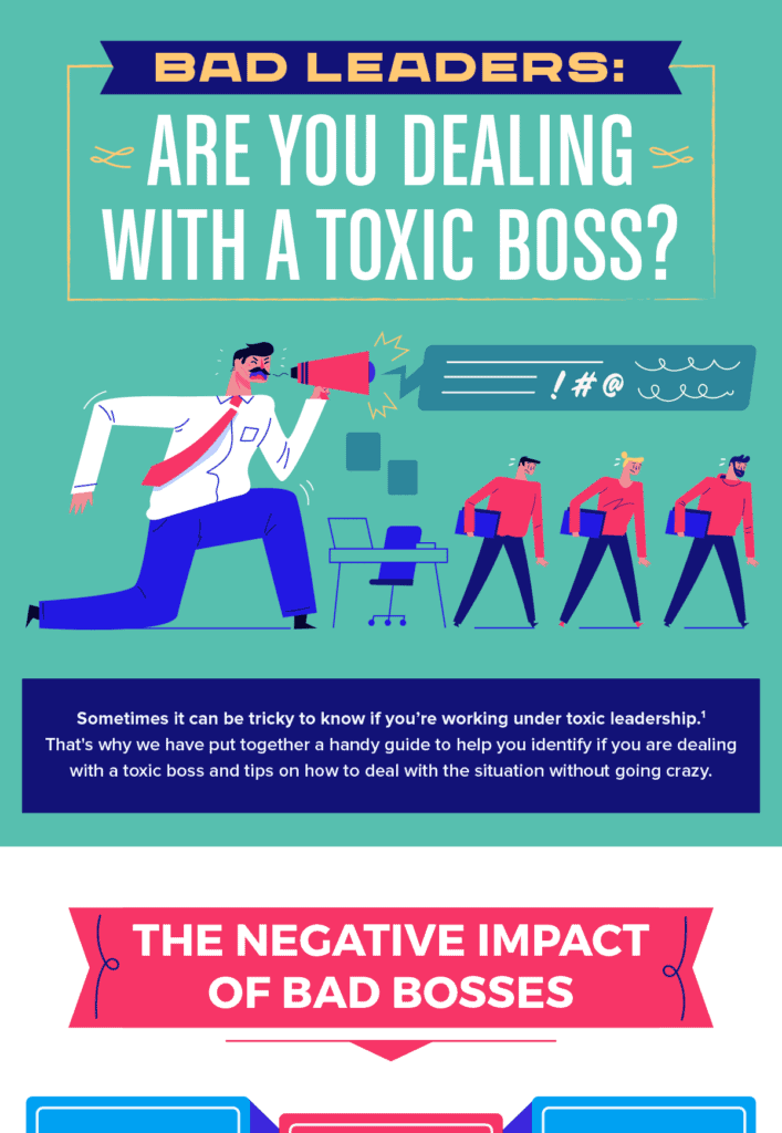
37. Toxic Boss
This is another colorful infographic that uses a wider palette to its advantage. It has been linked 81 times and has 44 referring domains. The infographic sets the right expectations from the very beginning with a descriptive subtitle and statistics to support the importance of its flow chart. The flowchart itself is detailed and the tips to deal with toxic bosses have been backed by expert quotes.
Statistical Infographics
These infographics use data visualizations to tell a story behind the data and showcase inferences so that the readers can see the bigger picture and appreciate the more minor details. Research shows that companies using data visualizations are 28% more likely to find important information on time.
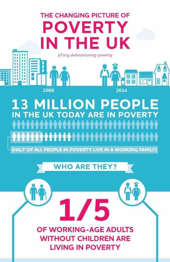
38. Poverty in the UK
This infographic uses contrasting colors with a white background. All the data flows perfectly with the storyline and we can see various types of visualizations, pictograms, bar graphs, pie charts, and multiple icons to bring the numbers to life. The on-point text presents context to the data in a concise way.
39. Email Hour By Hour
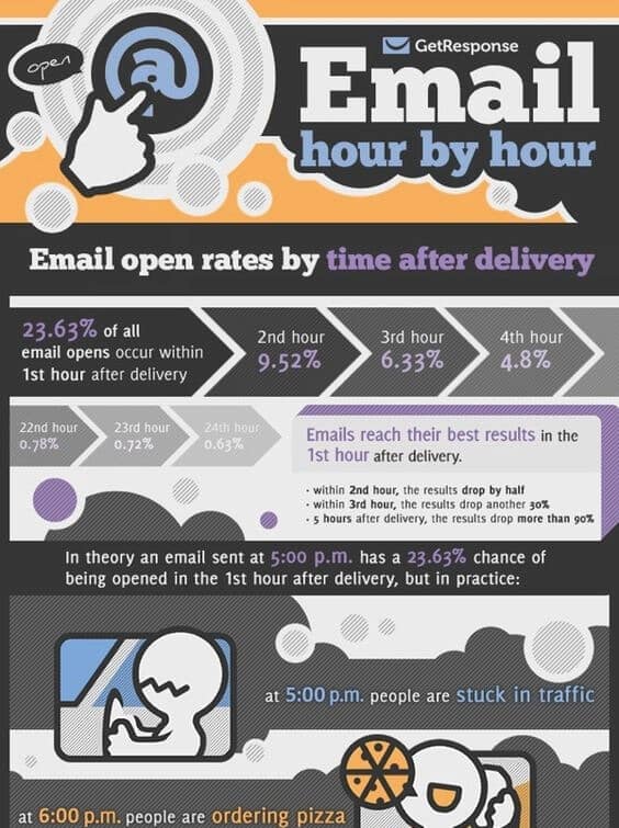
This infographic looks a bit busy at one glance, but it has some handy information once you start reading it. You get hour-by-hour of what happens to your email and what your target audience might be doing at that time. The infographic uses original data at each step to establish credibility.
40. Content Marketing Stats and Facts
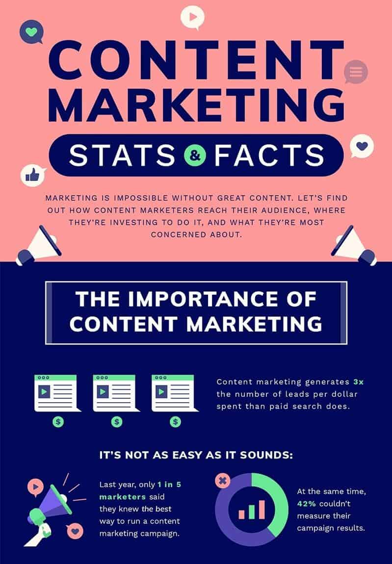
This infographic packs a punch and does many things right. As promised in the title, you’ll encounter many stats related to the evolution of content marketing, trends, and practices. No wonder it has been linked 581 times and has 320 referring domains. Each new section has a different color alternating between warm and cool tones, and on-point headers enhance scalability. All stats are supported by relevant text to present context, and actionable information makes sure readers have a clear takeaway from the content of the infographic.
41. Marketing Stats
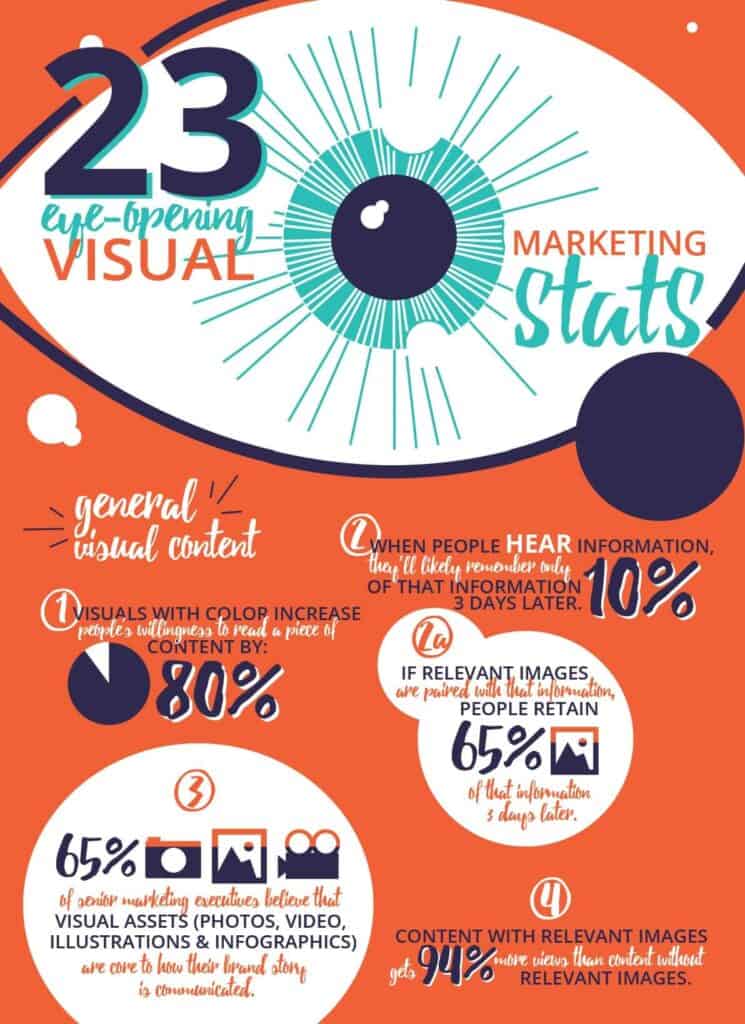
Here’s another infographic for marketing stats, but notice how different it is from the previous one. This one is more vibrant with a fun vibe. Cursive typography and descriptive writing work well to balance the rigidity associated with the numbers. Minimal use of data visualizations such as graphs and charts also contributes to the relaxed look. This infographic has 26 referring domains and has earned 32 links over time.
42. Facts About Rainforests
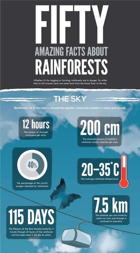
It’s a remarkable infographic full of exciting facts arranged in sections from the sky above the rainforest to deep into the underground caves and freshwater reserves. All the text boxes have a big and bold number followed by an interesting fact described in minimal words. The solid background of these boxes makes them pop against the vibrant background. It makes it easy to consume the information and prevents the infographic from looking overbearing.
43. Earthquake In Japan
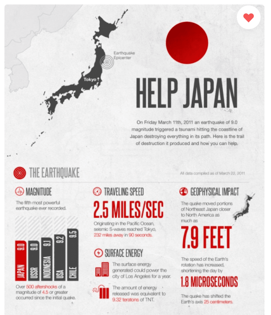
It’s a simple infographic sharing data about the destruction caused by the earthquake in Japan and how people can help. The dark colors on a light, plain background draw eyes to the facts and figures. The simple visualizations are used sparingly to keep all the attention to the damage and its effect.
44. How Many Steps It Takes
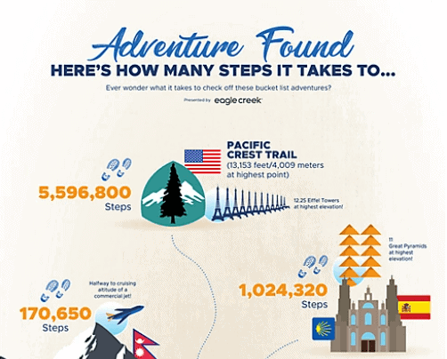
It’s a simple infographic for adventure lovers. Set against the plain neutral background, all the elements of this infographic hold an essence of freedom and seize the spirit of adventure. The topic and info are interesting for folks who love to travel and seek new experiences.
45. How Deep Can We Dive
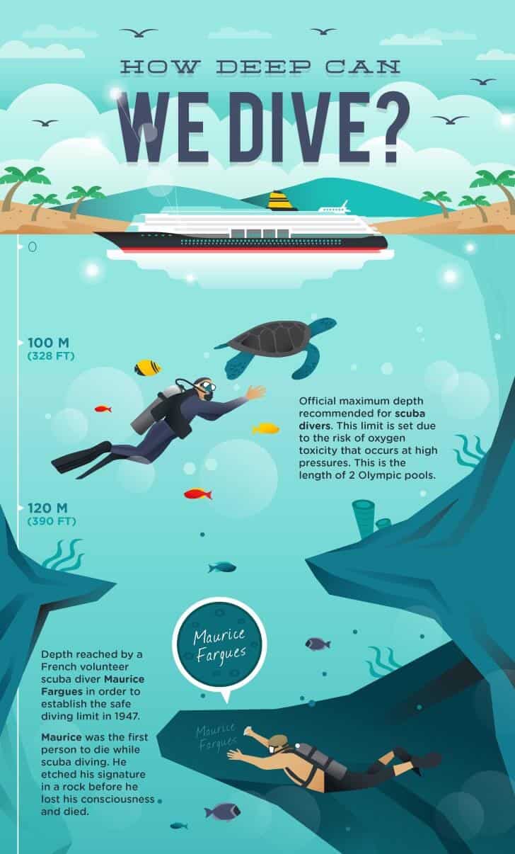
It’s another impressive infographic that has attracted 128 backlinks and 66 referring domains. Much like the infographic for Facts About Rainforests, this one presents information from the ocean’s surface down to its deepest crevices. The vibrant and engaging graphics are perfectly complemented by relevant descriptions. Each caption is full of exciting facts described by utilizing storytelling techniques.
46. Careers in Construction

It’s a short and simple infographic with warm tones and a minimal palette. The information is divided into three sections with bold headers to attract the readers’ attention. Each heading clearly describes what that section is about, and data is represented with the help of simple icons, illustrations, and on-spot text explanations.
47. Video Marketing Stats
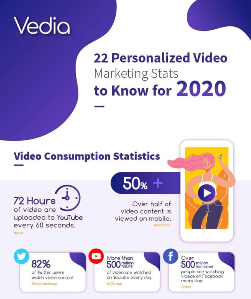
It’s a very clean, very beautiful infographic by Vedia and has earned them 62 backlinks till now from 44 referring domains. The statistics are arranged into two categories marked by prominent headers. Although we see graphical elements to soften the edginess of data, there aren’t any big data visualizations such as bar graphs or pie charts that contribute to the tidy look of this infographic. However, each statistic is accompanied by small visual elements to break the monotony and just the right amount of text to provide context to each stat.
48. Millennials Coming of Age
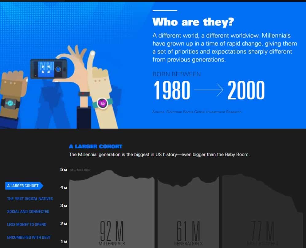
This infographic has a whopping 9000 backlinks from 1.8K referring domains. It’s an interactive infographic, which means you discover hidden layers of data as you interact with different elements in it. The infographic tells a sort of a story about millennials in clearly defined sections and brief text explanations about that aspect of the Millenials’ lives. The palette is predominantly dark with clever use of colors for different sections and data to back up all claims.
49. Stock a Cruise Ship
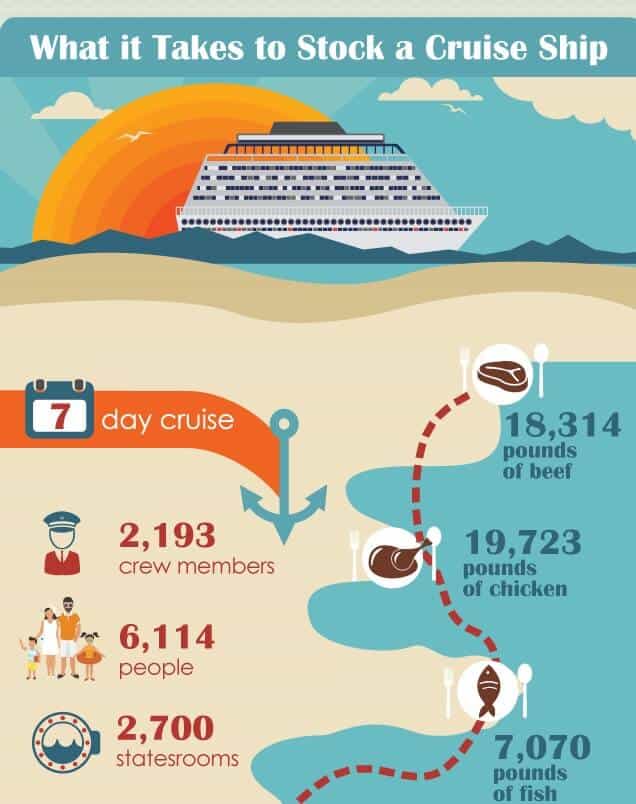
It’s a simple, good-looking infographic with cute and relevant visual elements accompanying the statistics, which are pretty fascinating themselves. The sheer amount of food stocked on a cruise ship has a shock value, excellent sharability, and an exciting topic to engage the target audience.
50. Perks of Preschool
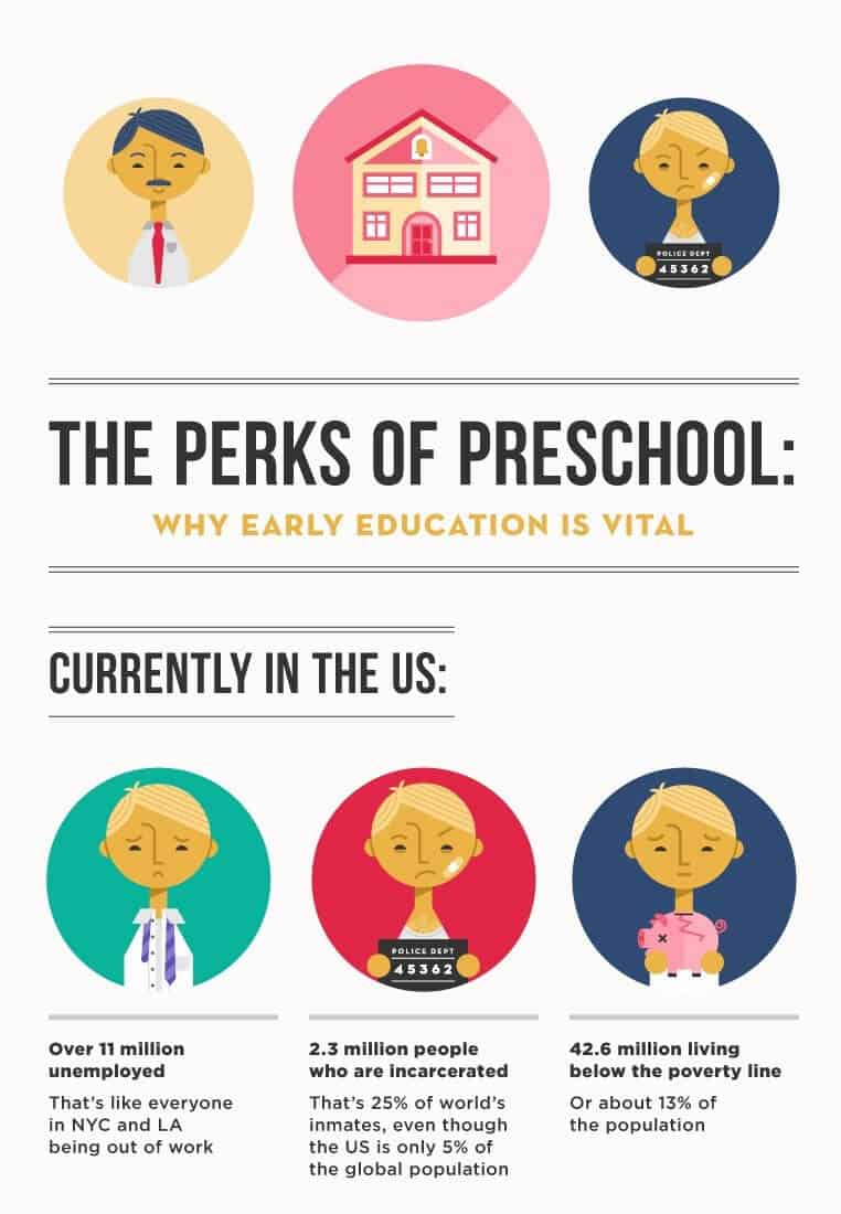
The title for this infographic successfully sets the case for preschool education. The visual elements are relevant to the statistics and the story they reveal. The white background keeps the focus on the stats and allows the facts presented in this visual to shine. Each claim is direct and concise, and backed up by data from authentic sources.
51. Cyber Security Facts

It’s a super cool infographic with 161 backlinks and 117 referring domains. It’s quite on the money for Hornet Security’s target audience, i.e., businesses that should be investing in cyber security. Damage caused by cybercrime worldwide amounts to $1 trillion, 38% of which belongs to the US alone.
The white background contributes to the tidy look, and graphics and text are in perfect balance. The infographic has crucial facts presented concisely. The text steers clear of the technical jargon so that the audience can understand the necessity of cyber security.
Checklists and Cheatsheets
Checklists and cheatsheets are pretty popular. People love them, especially if they’re packaged as infographics because then you get the entire info package in an easily accessible format. These infographics work best when you have recurring tasks, and you want to ensure that all important tasks get done.
52. Gmail Hacks
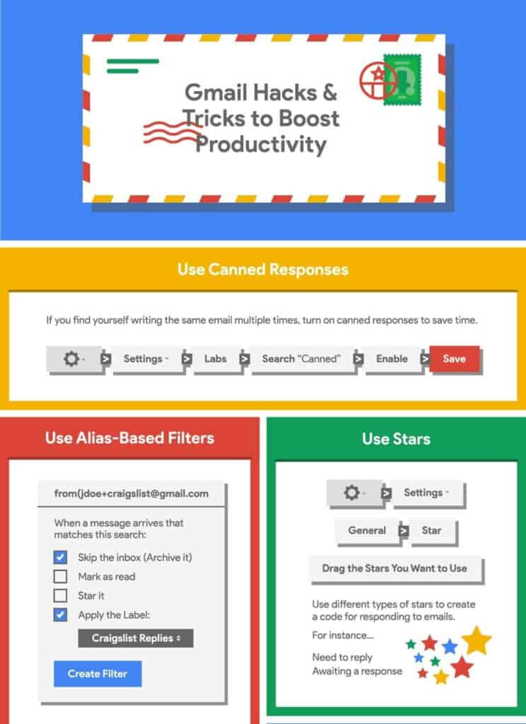
This infographic is your cheat sheet to organize your Gmail, autopilot your emails, never miss another important message, and never dread to open your inbox after a vacation. It’s vibrant with many contrasting colors set against a neutral white background to highlight the content. Each section has a clear heading with actionable advice and steps to perform each hack. This infographic has been linked 132 times till now.
53. Baby Development
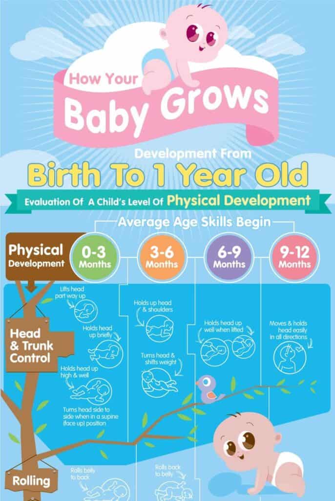
This infographic uses soft baby colors and serves as a handy resource for parents to track their babies’ milestones. The infographic has two distinct categories separated by descriptive headlines. The development levels for each skill are displayed in different colors for easy tracking. It’s a beautiful infographic that the parents can print out and hang in the nursery. Short phrases and occasional examples with each illustration explain the milestone for each category in as few words as possible.
54. On-Page SEO Optimization Checklist
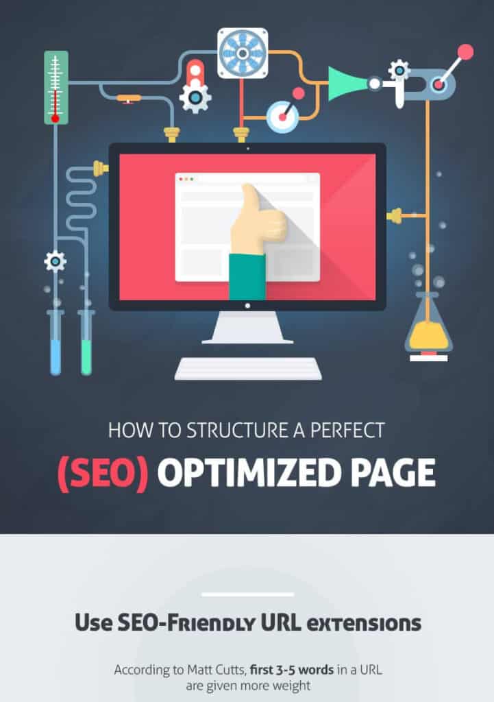
A handy checklist for optimizing the SEO of any page, this infographic is concise and to the point. You can see the economy of words, and simple illustrations keep it engaging. No wonder it has 631 backlinks from 209 referring domains.
It’s a perfect checklist because you can start from the beginning, tick off all the things you’ve done right, and make the changes as you move down the infographic. Each piece of advice is actionable, and there are precise explanations about how and why you should take a particular action. Data is also used to emphasize the importance of some of the points and really drive the message home.
55. Kitchen Cheat Sheet
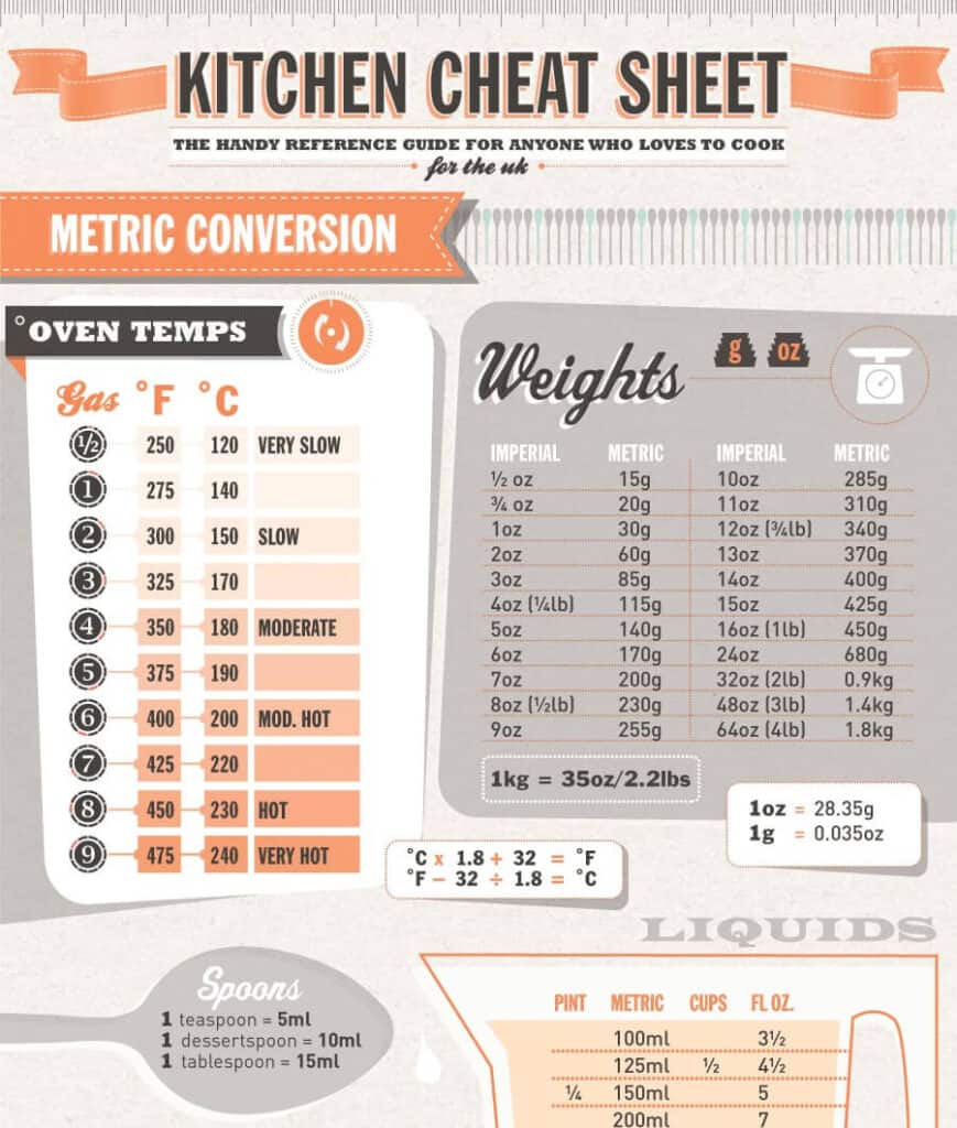
This cheat sheet has everything you need in a kitchen, whether you’re into baking, grilling, or plain ol’ stovetop cooking. No wonder it has been linked by 181 referring domains. Hang this in your kitchen and never get your conversions or cuts wrong, or over or undercook anything again. There are clearly marked sections, and you will find precise advice for do’s and don’ts wherever required. A minimal palette against a solid background prevents the infographic from looking too busy.
56. Manual Photography Cheat Sheet
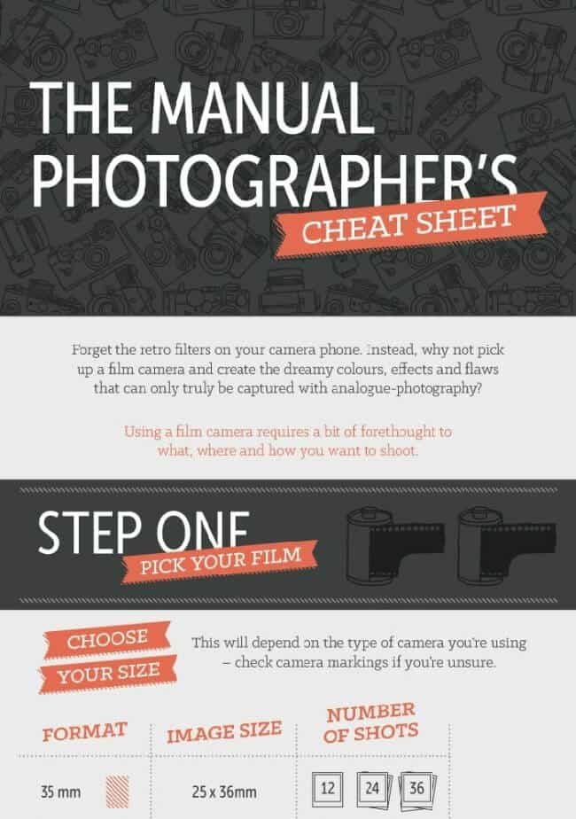
The clean look of this infographic is in part due to the minimal palette and structured design. Actual photos and illustrations are used together to provide photographers with a realistic view of the results. This infographic is a handy resource for manual photographers to quickly access the information they need. Everything has been explained concisely, and tips are accompanied by their results so that the photographers can see the visual difference they create.
57. Sales Search Cheat Sheet
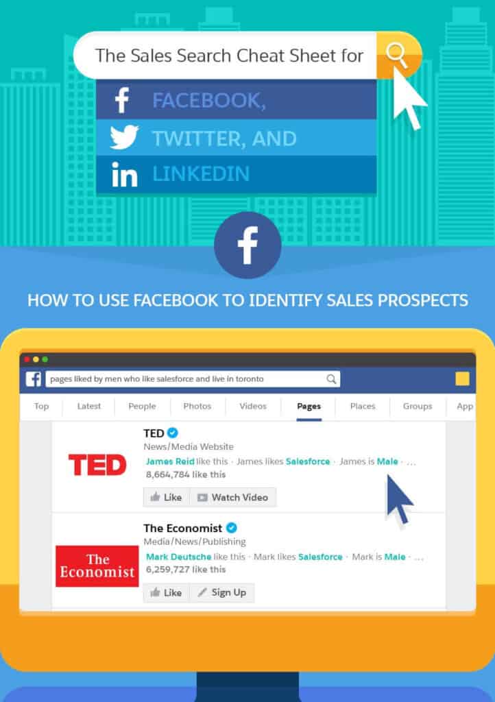
This handy cheat sheet categorizes information by the major social media platforms, Facebook, Linkedin, Twitter. This infographic uses screenshots from each platform to give readers examples of what the results should look like. You will find actionable tips and exact words and search modifiers to perform an advanced search on each platform.
58. Hiking Packing Checklist
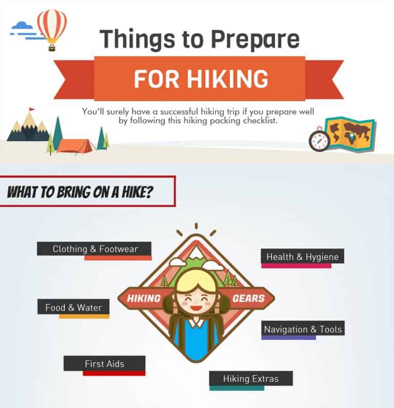
It’s a short, handy checklist for essentials to pack for a hiking trip. The infographic divides the gear into categories and gives examples for each category along with a helpful, actionable tip. Soft colors are used, and there’s enough white space to prevent any cluttered feel.
Timeline Infographics
When you need to show successive events over time, such as the history of an occurrence or progress over time, you can use timeline infographics to make them flow visually. We can process visuals 60,000 times faster than text and timeline infographics are great at showing the bigger picture spread over a period of time.
59. Logo Evolution
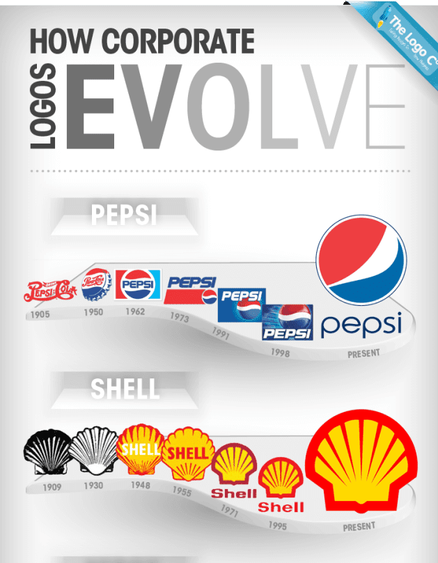
It’s a pretty cool infographic on a topic relevant to the Logo Company’s target audience. What makes it more engaging is that it features well-known companies and mega businesses. The infographic design is simple to not distract the audience from the changes in the logos of these big companies over the years.
60. Evolution of the Telephone
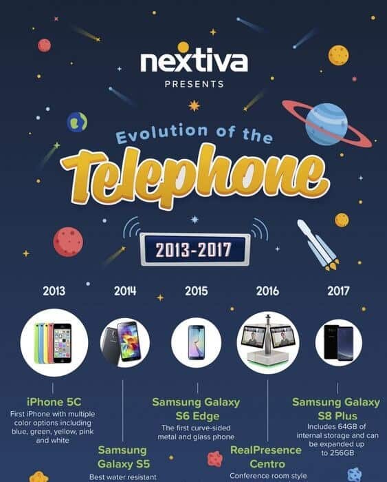
Starting from 1876 Alexander Graham Bell to 2013’s iPhone 5C, this infographic is not only engaging but highly informative too. It incorporates actual photos along with illustrations and labels each phone in large, easy-to-read text. You can also find salient features or interesting information about that model under each label. The infographic is divided into time periods during which significant changes occurred in telephone technology. This valuable infographic has been linked by 36 referring domains.
61. Final Girls in Horror
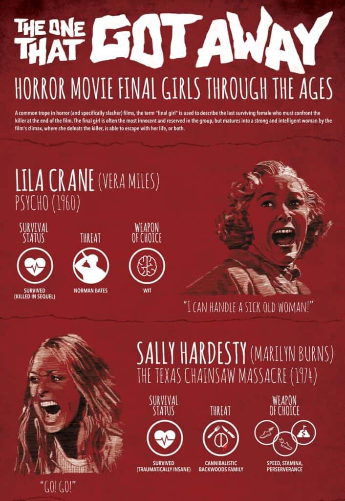
This one’s an excellent infographic for horror movie lovers. The design is simple, with just the right amount of information about the final girls—their role, choice of weapon, threat, and survival status—arranged in chronological order. The entire look of the infographic is gory, with blood-red background and white text.
62. Wedding Planner
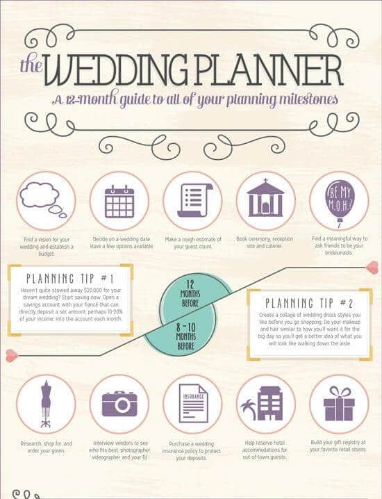
Shane Co. deals in different gems, so this infographic is spot-on for a large section of their target market. The infographic can act as a checklist or a task sheet arranged chronologically from 12 months before the wedding to the big day. Moreover, there are 12 handy tips related to different tasks involved in planning a wedding.
The timeline is in the form of suggestions or deadlines for the tasks that the couple should complete within the proposed duration. It’s effective because it breaks down the entire planning into manageable steps and instantly takes the overwhelm out of the equation. The soft colors match the wedding theme perfectly.
63. History of Pandemics
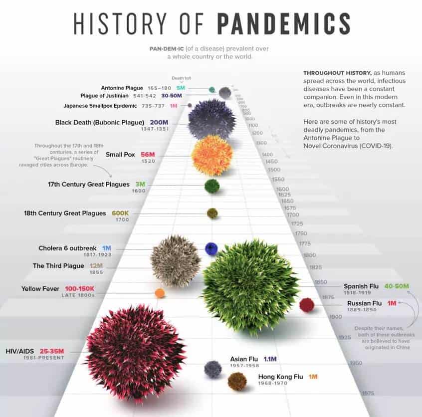
COVID is a current disease in a long line of pandemics that have plagued the world and continue to do so. This timeline infographic begins from the Antonine plague in 165 to recent times. Colorful germ-spheres dot the timeline in neutral colors. The size represents the relative number of deaths they have caused.
There are some interesting facts and crucial details for a few of the most notorious epidemics in history. This infographic has attracted 8.5K backlinks from 2.4 referring domains in a two years’ duration and still counting.
64. Nursing History
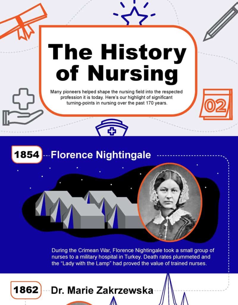
Starting from the legendary Florence Nightingale, this infographic not only pays tribute to her but also details the timeline of the Nursing Profession as it evolved over the years. The introductions and the descriptions capture the milestones of the nursing profession accompanied by stats to establish its importance.
The design has a limited palette with a nice balance of text and illustrations to highlight Nursing heroes and their contribution to this noble profession.
65. Comet ISON
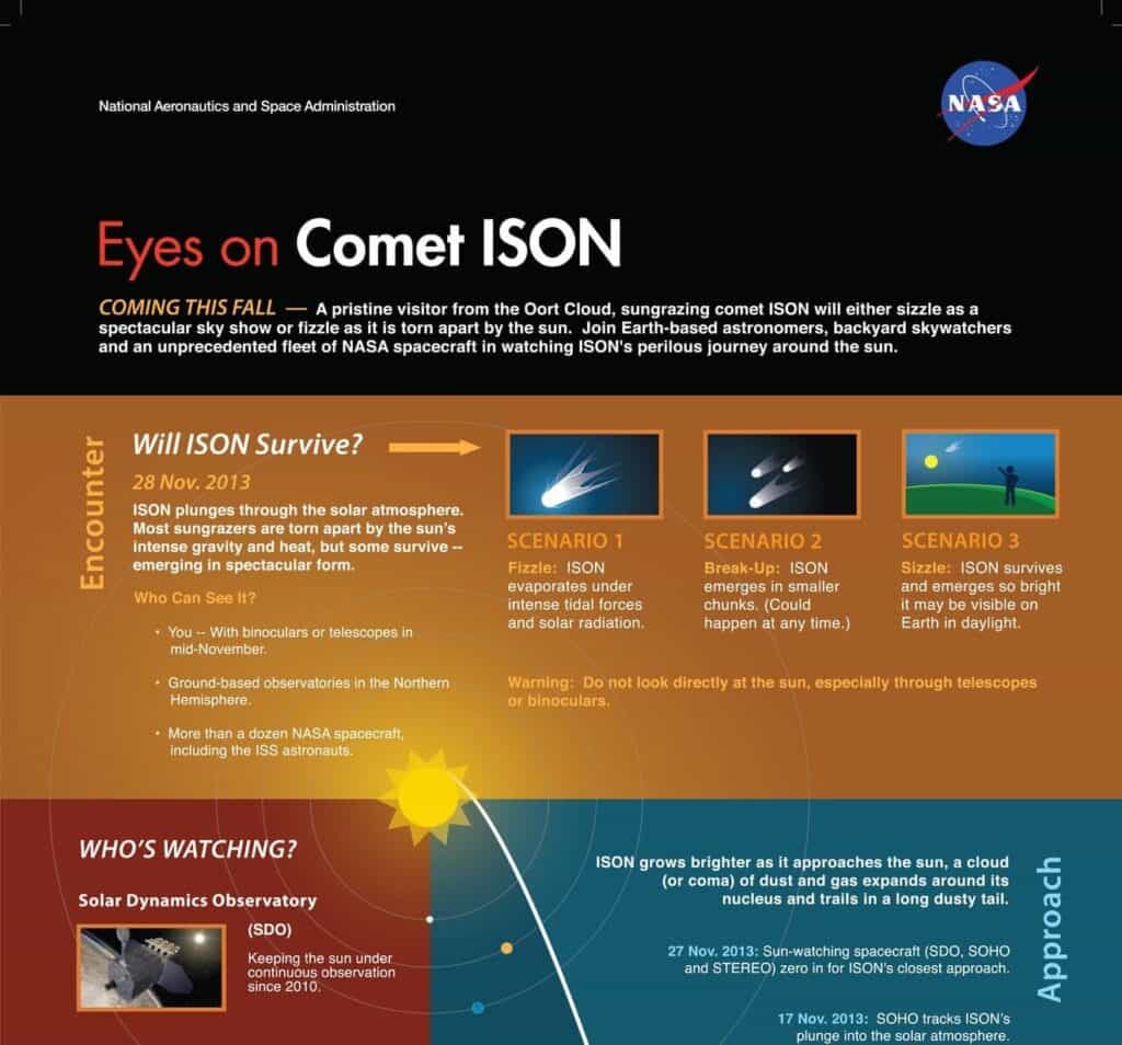
Nasa created this infographic to document comet ISON’s path and changes during its more-than-a-year journey to the Sun. It’s a simple infographic using contrasting warm and cool shades. With a timeline and description of various events during the comet’s path on one side, you can see original photos of the observatories and read about the equipment used at different positions during this period in the side panel.
66. Space Tourism History
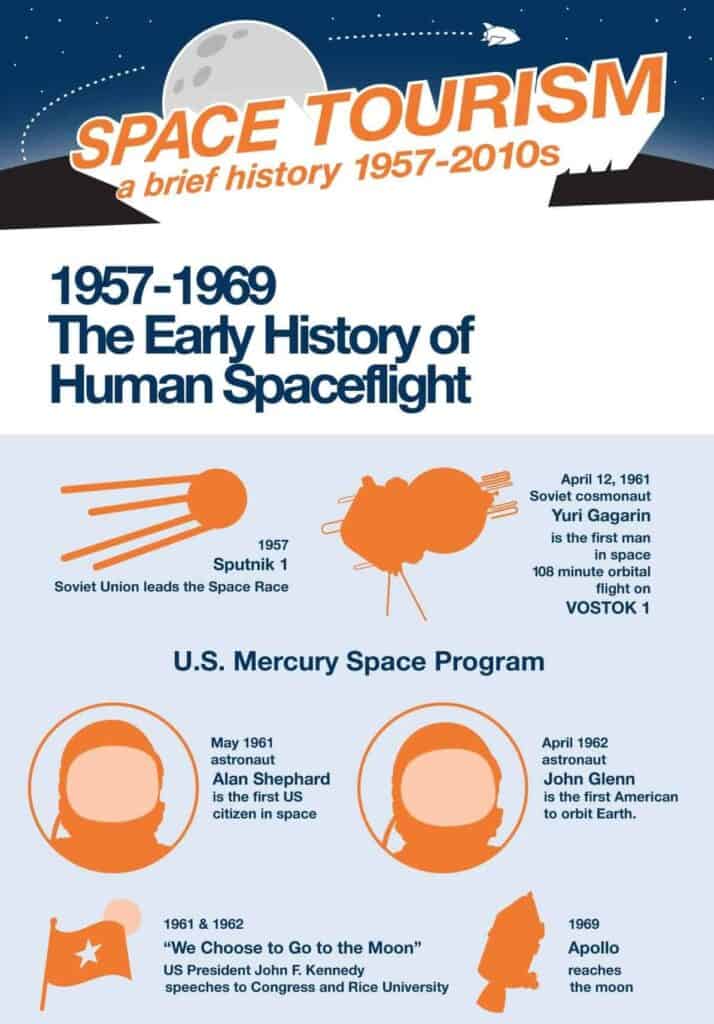
Space Tourism has a fascinating history which started in 1957 with Sputnik I, but now there are many commercial space tourism companies in the market. In this infographic, you will find enough details about all the crucial milestones and inventive ways designed by scientists to travel in space.
Sharp, warm tones with soft cool ones keep the focus on the timeline and the changing landscape of the Space Tourism market. This infographic has been linked by 25 referring domains till now.
67. History of the Solar Energy
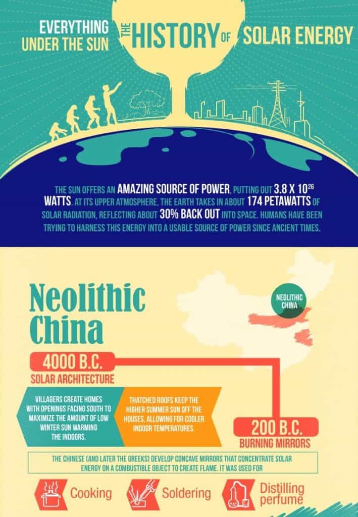
It’s shocking to know that solar energy was being used by ancient civilizations as far back as 4000 BC, and by 200 BC, they were already manipulating the sun rays through concave mirrors. This is an interesting infographic with a simple timeline, minimal illustrations, and fascinating facts about scientists and solar inventions.
68. LGBT History
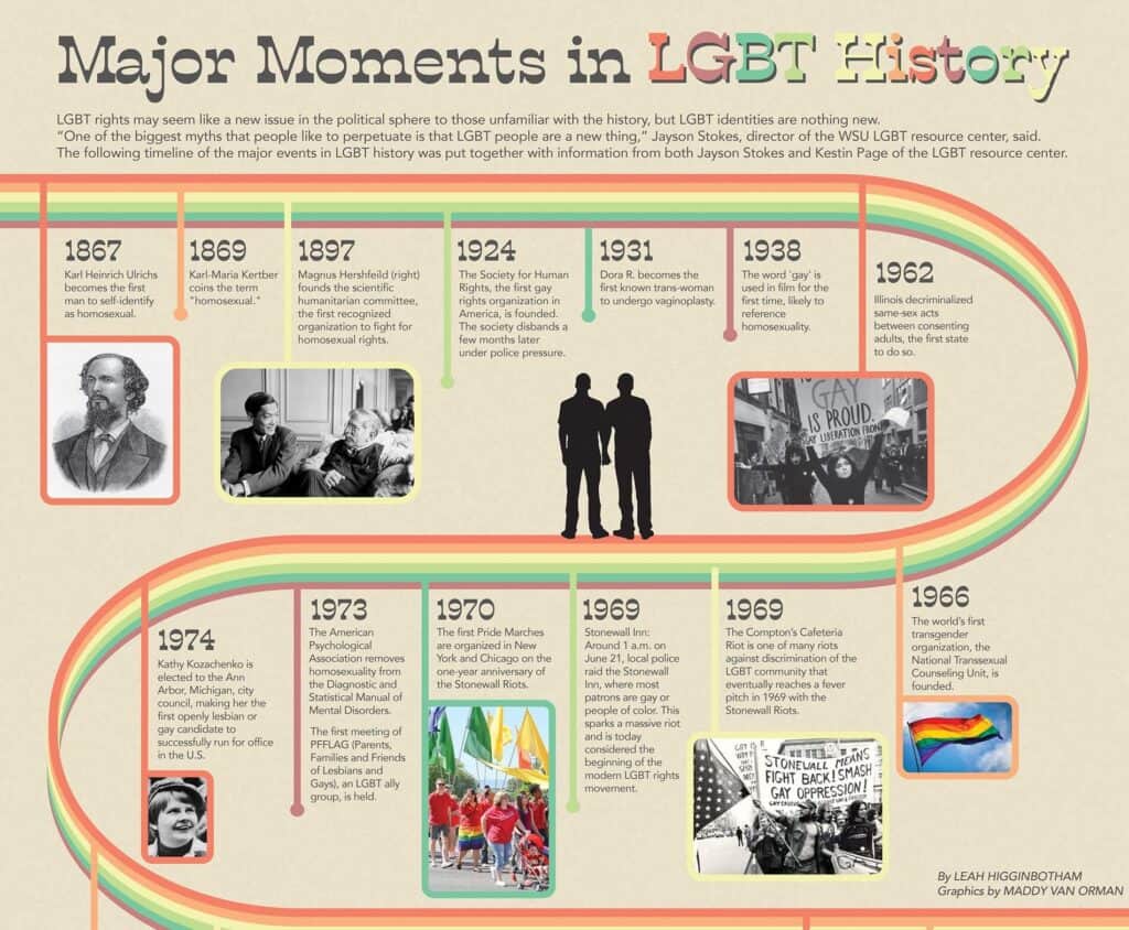
This infographic celebrates the significant moments in LGBT history and uses a plain background with a rainbow timeline iconic of the LGBT community. Each point on the timeline has a description that brings to light a significant historic event to mark the advancement of the LGBT cause till that point in time.
Notice the absence of illustrations and the presence of actual photos of actual people, which lends a certain power to the infographic.
How To Infographics
These infographics typically break down a task into smaller steps or provide various tips or step-wise instructions on how you can achieve a goal such as weight loss, building muscle, improving communications skills, etc. Research shows that visuals can increase productivity by 15% compared to those who don’t have visuals to aid their task.
69. Resistance Band Workout
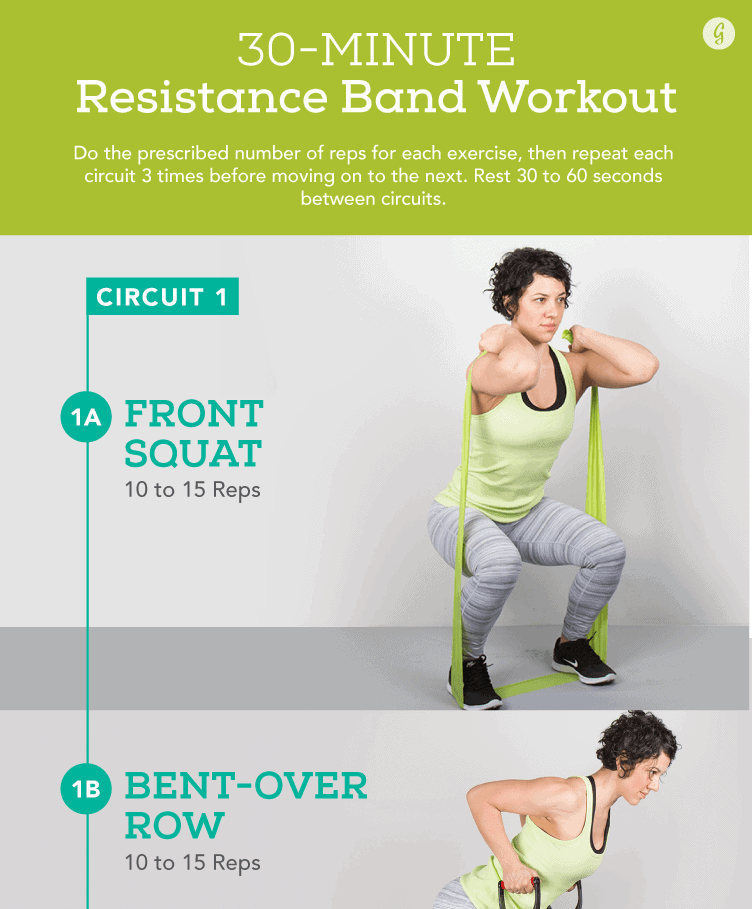
It’s a very simple infographic with a clear title and a descriptive subtitle followed by three circuits, each depicted in a different color. The minimal design keeps the focus on the exercises, and the number of reps suggested for each workout. Images are self-explanatory and the text pops against the neutral background.
70. Turn Cleaning Into a Workout
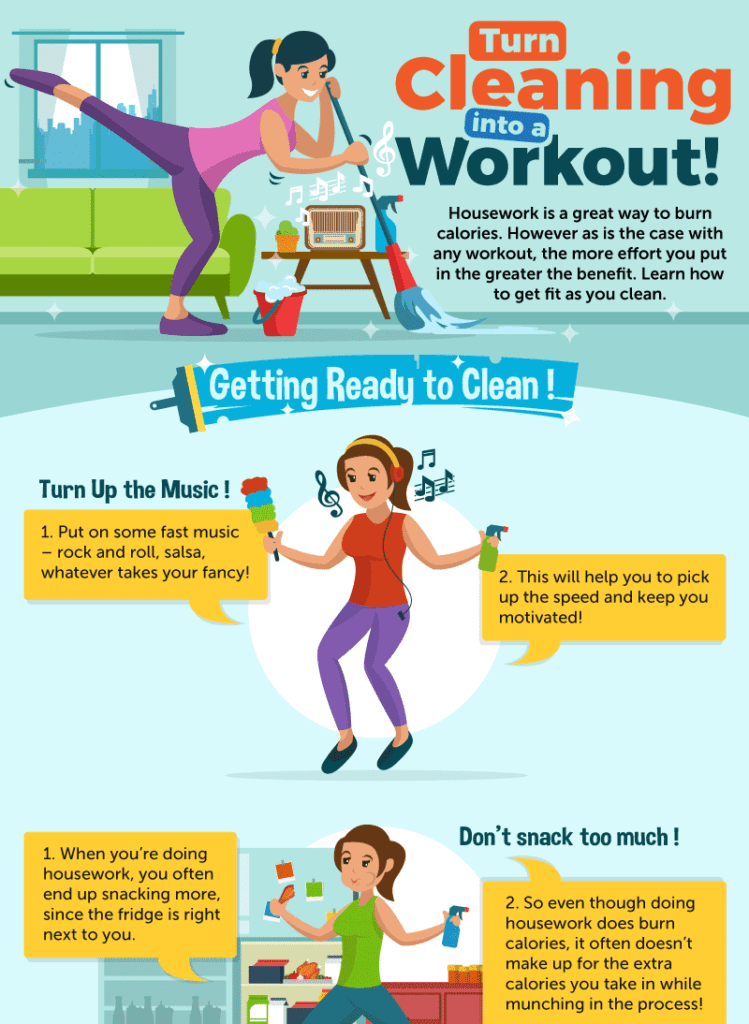
This is a fun infographic that merges workout and cleaning, both of which may seem like a chore to many people. It motivates the readers by telling them how many calories they can lose with each chore. Moreover, you also get detailed advice and actionable ways to include exercise steps during vacuuming, dusting, or other regular tasks.
Overall, this infographic has a soft and cool background with colorful illustrations, eye-catching graphics, and spot-on tips and suggestions.
71. Email Newsletter Writing Guide
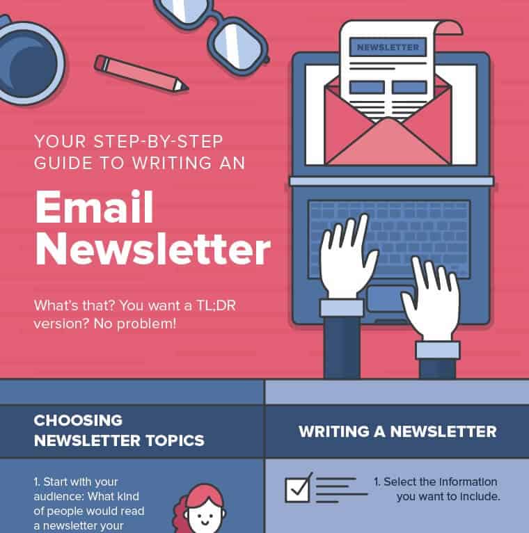
Around 37 referring domains have links to this infographic, which truly serves as a TL;DR on how to write an email newsletter. The title and subtitle set a clear intention for this infographic. From choosing the topics to creating the final design and tracking the results, everything is covered in ample detail but with an economy of words.
Actionable descriptions and cute graphic elements keep the readers engaged and make it a valuable resource for quick reference. The contrast of warm and cool shades with gray undertones gives this infographic a rather serious vibe.
72. Mobile Retention Strategy
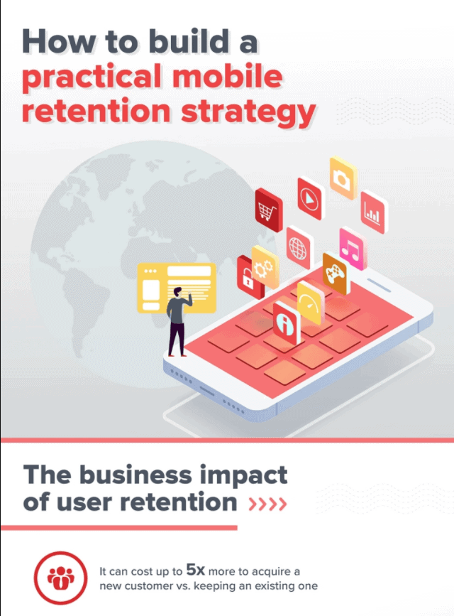
Using a limited palette, this infographic sticks to neutral hues and alternates between the shades of black and red to convey the information. In three clear phases, the infographic not only mentions the importance but also gives practical tips to take action. Tips in text boxes draw attention and form an interactive illusion. Each bit of advice has sources mentioned right there, which builds credibility.
73. How to Optimize Welcome Messages
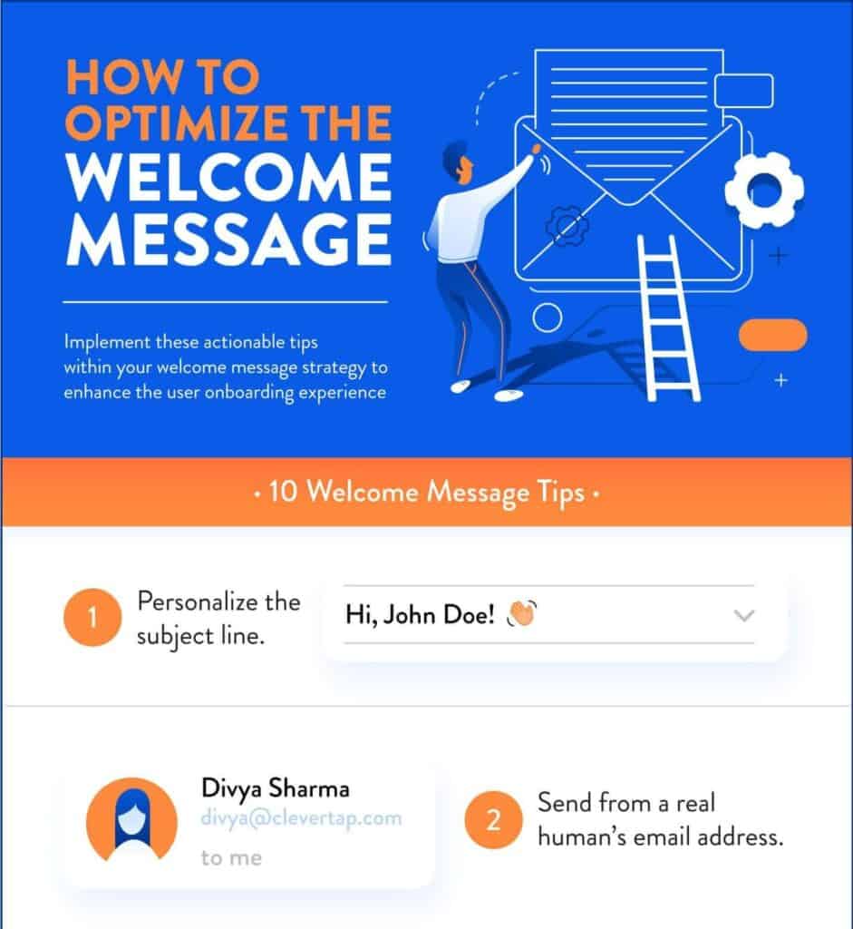
This infographic uses warm and cool tones against a neutral background to avoid the busy feel. Each step has an actionable tip or an example to clarify the point and meaningful illustrations drive the message home and keep it engaging. It’s an excellent example of a simple yet effective infographic and has won 321 backlinks from 72 referring domains since its publication.
74. How to Keep Kids Healthy
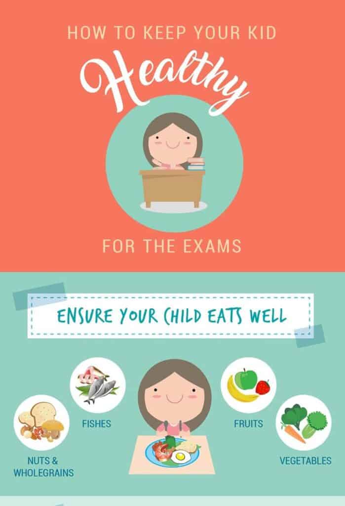
The subject of this infographic is on-point for the target audience of Mount Elizabeth ‒ a private hospital in Singapore. The soft tones of this infographic match the topic of kids and their health during exams. It has helpful illustrations, and minimal text is used to convey the information. Each section has an actionable heading, and further instructions are also simple, to-the-point, and easy to follow.
75. How to Give First Aid
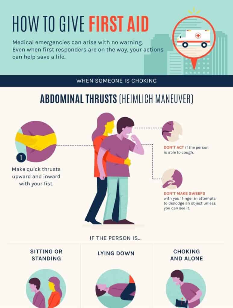
This infographic can potentially save lives as it has clear instructions on offering first-aid in different common emergencies. The illustrations in this infographic are successful in visually demonstrating the instructions relayed in the text. All the instructions are clearly described with actionable words and numbered steps.
In the end, we can see a call-to-action‒an essential component of any infographic‒that invites the audience to the Red Cross certification course.
76. Sleep and Technology
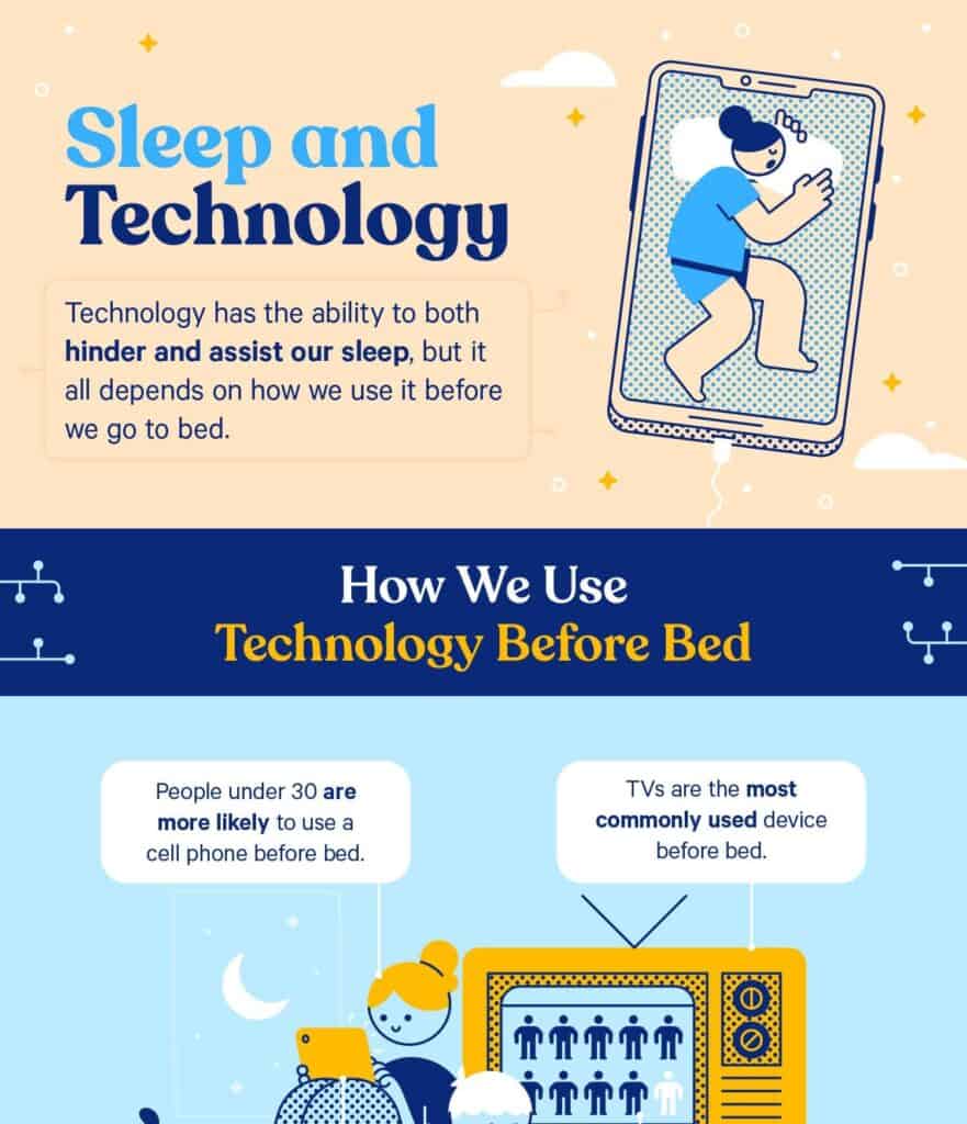
We can see Casper’s brand colors in this infographic right off the bat. Since Casper is a mattress company, the topic is spot-on for the target audience. The information is relayed in three logical segments, each with relevant illustrations and text explanations. Actionable tips and facts based on interesting surveys and research make this infographic engaging and valuable for the readers.
77. Flawless Loyalty Program
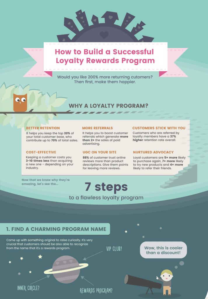
This infographic uses darker shades and gray undertones to what otherwise would have looked like a vibrant palette. It has cool, engaging illustrations and complete information about the topic. The topic is highly relevant to the target audience of Antavo Loyalty Software and we see a CTA in the end as well.
It uses data in the headline to grab the readers’ attention and then highlights the benefits of a loyalty program. Then it gives seven actionable steps, complete with examples and why each step matters.
Process Infographics
When processes are explained in the form of visuals, the chance of misinterpretation and error decreases by 80%. Moreover, you can download these infographics and easily access them on your smartphone as you follow the exact steps.
78. Customer Lifetime Value (CLV)

This infographic uses dark shades in a predominantly cool palette with enough white space to prevent a busy look. Before the exact process, we can see the CLV formula in the form of illustrations which is cool, followed by stats that establish the importance of the topic and grab the readers’ attention.
Each step in the process has a tip and a real-life example to give a practical perspective to the reader. This infographic has been linked 83 times by 59 referring domains in a very short duration.
79. Business Continuity Plan
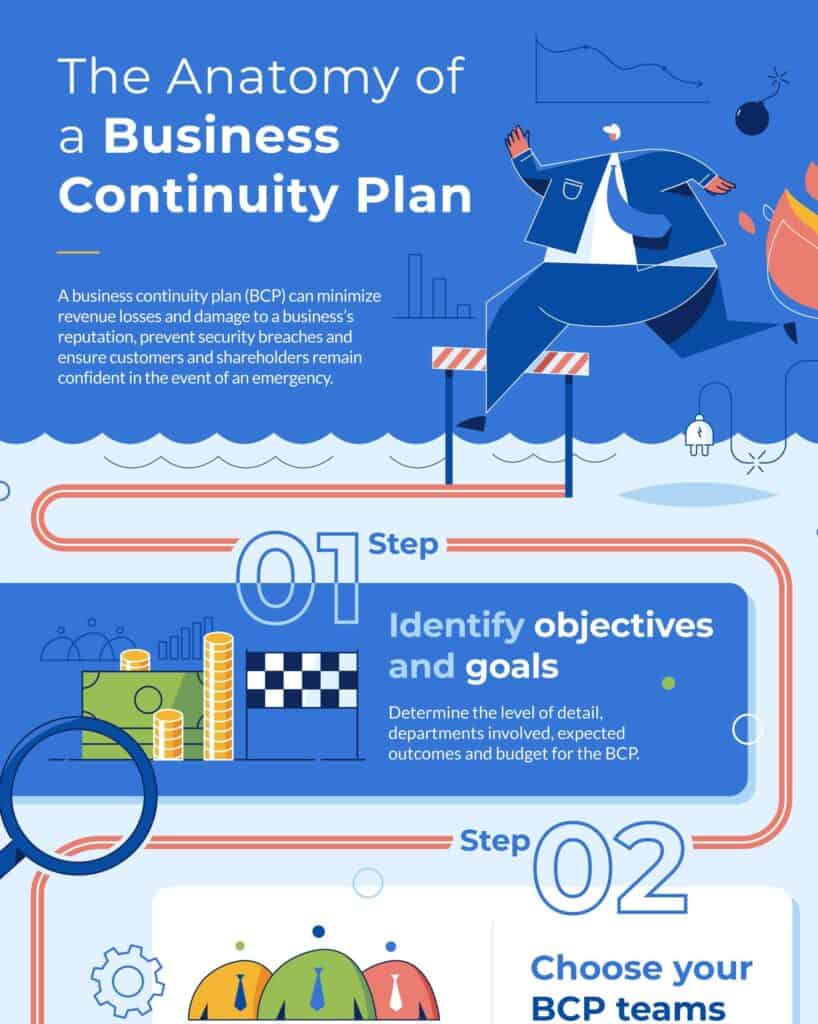
This attractive infographic has 278 backlinks from 92 referring domains. The title promises a business continuity plan to attract readers, and the description briefly mentions its benefits to incite the reader’s interest further.
Each step has a descriptive heading, and the text explanations are direct and to the point. They are easy to follow and can be put to action immediately. Fun illustrations and a cool palette are also a highlight of this visual. They are huge but not overbearing and seem to merge into the background thanks to the strategic placement and carefully chosen colors.
80. Winter Vehicle Safety

This simple infographic gives you a run-down on how you can make your car safe for winter. The process or steps serve as a checklist, displayed in sharp, warm tones against the dark, cool greyish blue hues. Each step is supported by mentioning its importance and any necessary actions to mitigate the risk. It’s a convenient resource for driving in winter.
81. Drinking Water Treatment
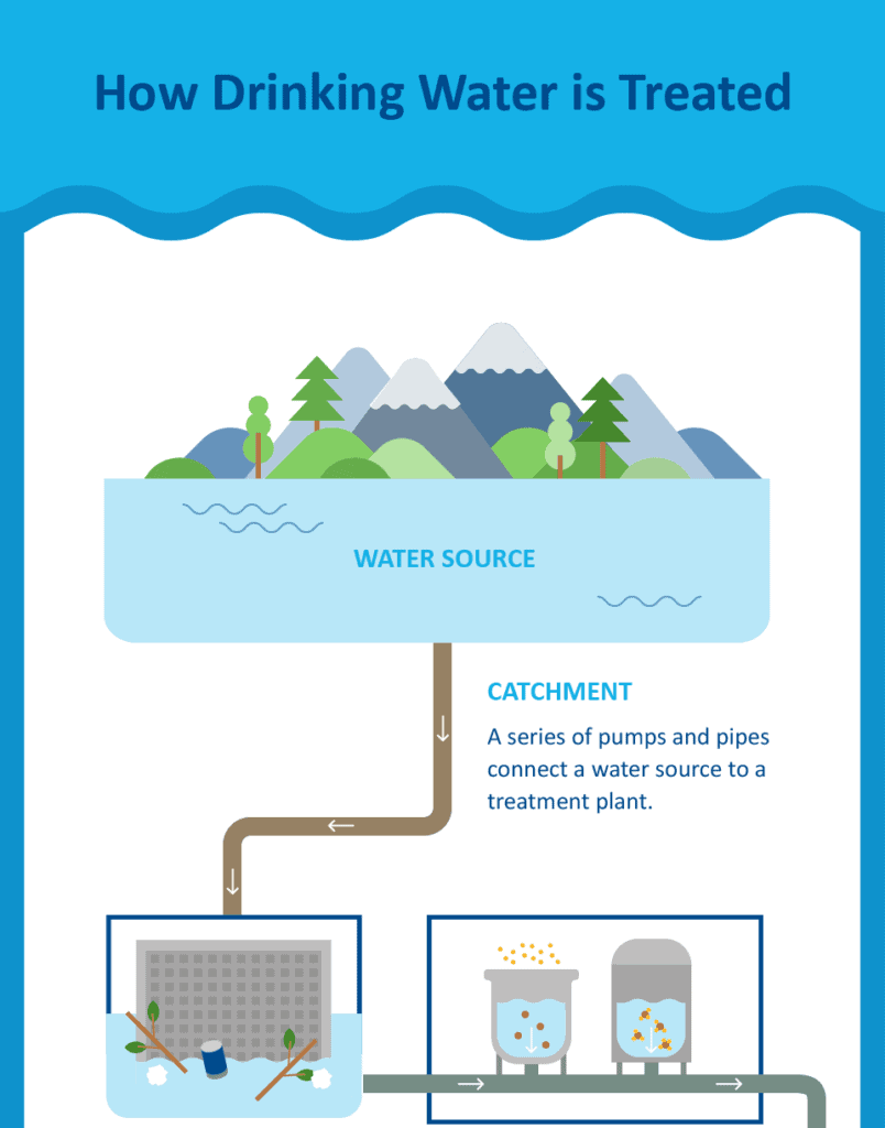
If you were ever curious about how drinking water gets treated, this infographic uncovers the mysteries for you. It’s a simple visual that explains the entire process in a series of steps, each supported by relevant illustrations to visually show what’s happening at that stage. The text explanations further clarify the processes at each step. The color palette is cool, soft, and minimal, with lots of white space that balances the complexity of the process.
Animated Infographics
People love animated content ‒ Giphy has over 250 million monthly users with a view time of 11 hours daily. Animated infographics can bring your visuals to life by animating charts, illustrations, graphs, and texts to add some movement. You can simplify a complex process by using these moving bits.
82. How Solar Panels Work
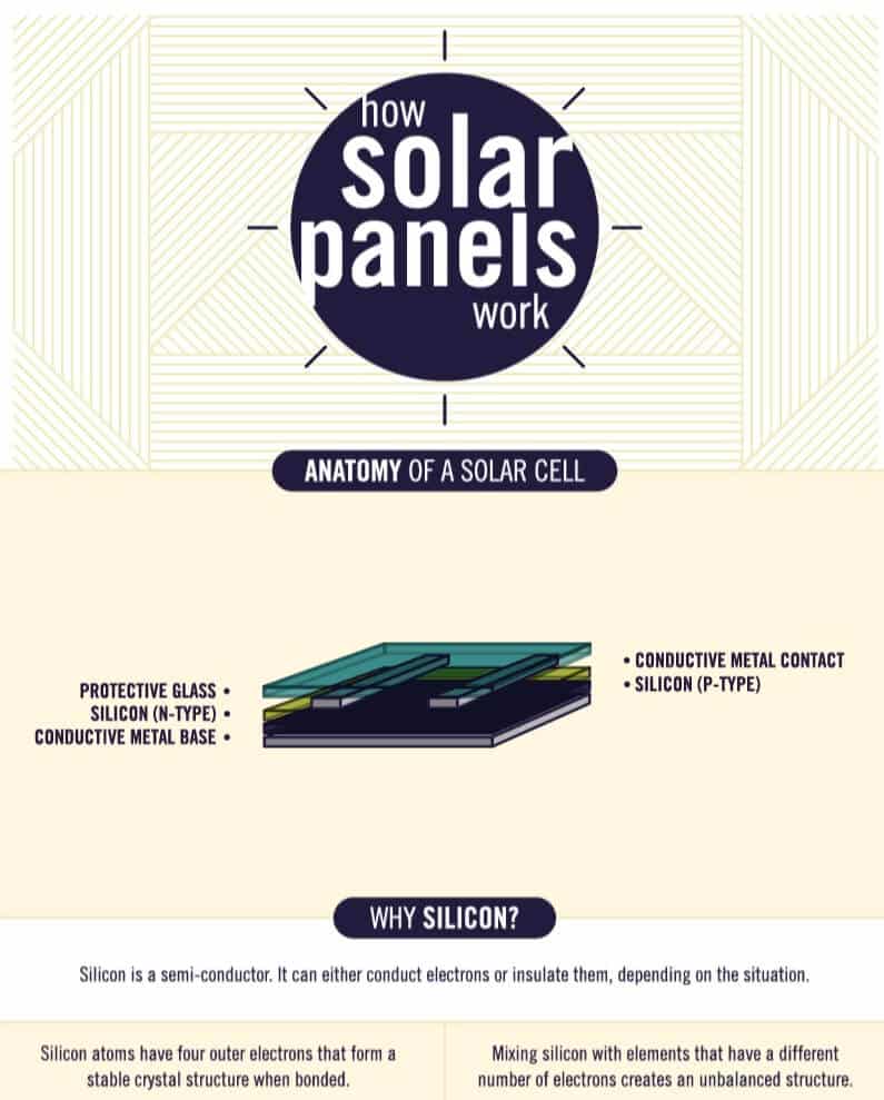
That’s high school science made easy for their target audience by Save On Energy. No wonder it has been linked 154 times and has 82 referring domains. Using small animated elements, this infographic explains different layers of a solar panel, its internal mechanics, and how it powers your house.
Each step is supported by text explanations that use simple words and avoid technical jargon so that everyone can understand how solar panels work. The palette and the design are minimal, focusing on helpful illustrations to keep the demonstration smooth and under focus.
83. Anatomy of a Green Home
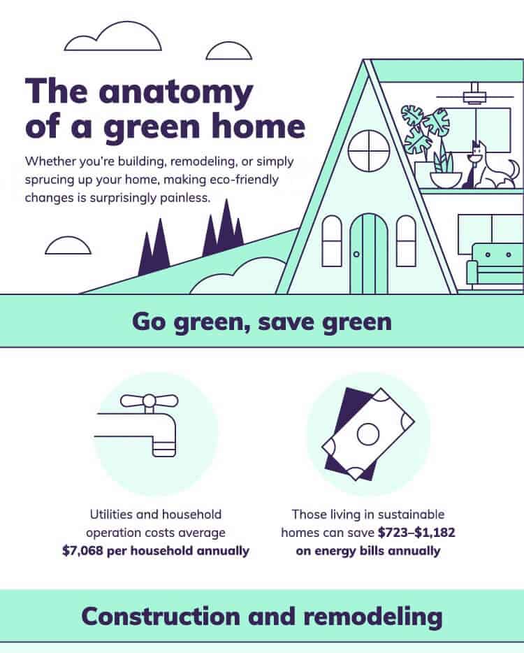
It’s an excellent resource for eco-friendly people who wish to build a greenhouse. The tones predominantly are soft and light with dark colors to highlight text. The infographic has green tips for each room while the animated elements draw the eye and improve engagement. All tips are immediately actionable and supported by examples, explanations, or cool facts to make them engaging and informative.
84. How Google Works
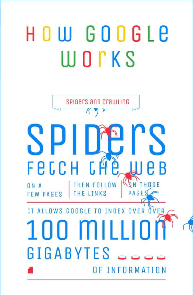
At once visible are the vibrant branded colors of Google and its creepy crawlers. It’s an oversimplified version of how Google works but has enough information for Quicksprout target audience.
All the information is arranged in segments and offers to-the-point insights into Google’s working mechanisms. Each point is explained with examples, and animated elements are utilized to elaborate on specific points visually. It has a whopping 400 backlinks and 153 referring domains.
85. How a Car Engine Works
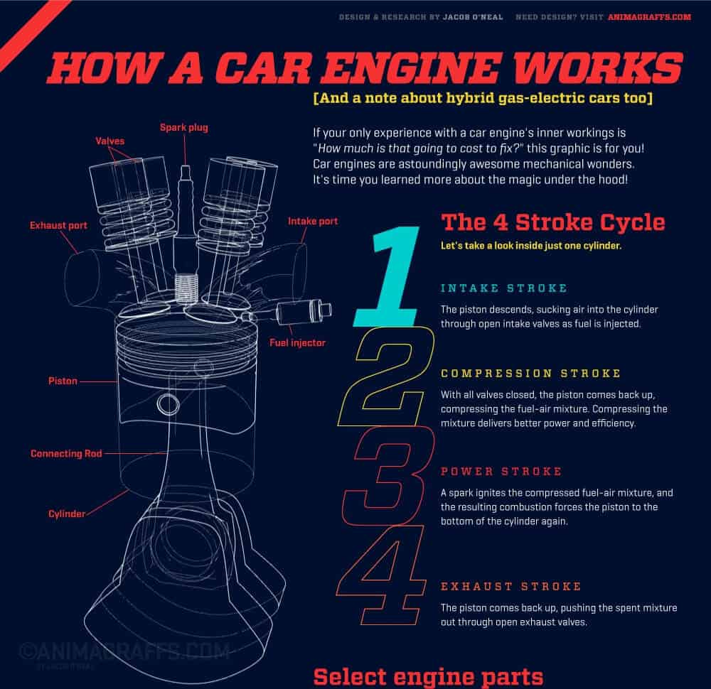
It’s no surprise this infographic has 1.5K backlinks from 450 referring domains. It might have been challenging to pull this off without the animated elements. After all, explaining how a car engine works isn’t a small feat. The dark background really makes the illustrations, animations, text, and colored sections pop and aid understanding.
This is one impressive sample of an animated infographic. Animated elements are complemented with text explanations. The use of simple words is crucial in infographics that aim to explain complex processes in simple ways.
86. How Bridges Are Built
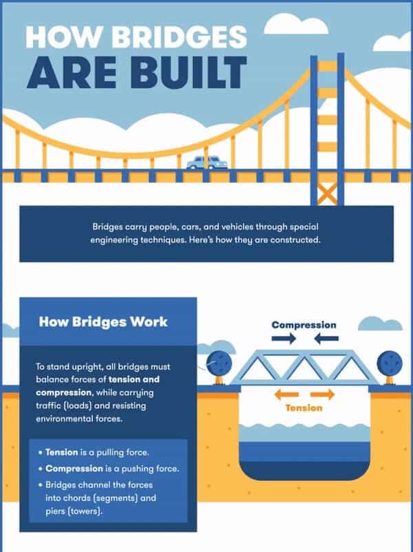
Big Rentz is an equipment rental company, so this infographic topic is super relevant to their target audience. The automated elements complement the text to enhance understanding. Different design considerations are followed by the building process, and they are explained in the infographic in a concise way. A limited palette is used to avoid distraction and prevent overcrowding.
87. Career in Logistics

If you’re considering a career in logistics, this infographic displays all the essential numbers to convince you about what a great opportunity it can be. The data is divided into three sections and supported by relevant statistics. The animated elements keep it engaging and entertaining.
88. The Cost of Being Harry Potter Fan
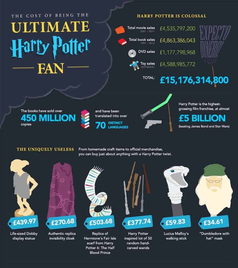
It’s a fun (and eye-opening) infographic by Money Supermarket. If you’re a Harry Potter fan, the cute visual elements and astonishing numbers against the dark (magic) background will attract you. And, if you’re a hater—just look at the price of the uniquely useless things and rest your case! At the end of the day, it’s a win-win for Money Supermarket, no matter where their target audience’s loyalty rests.
89. Lead Nurturing
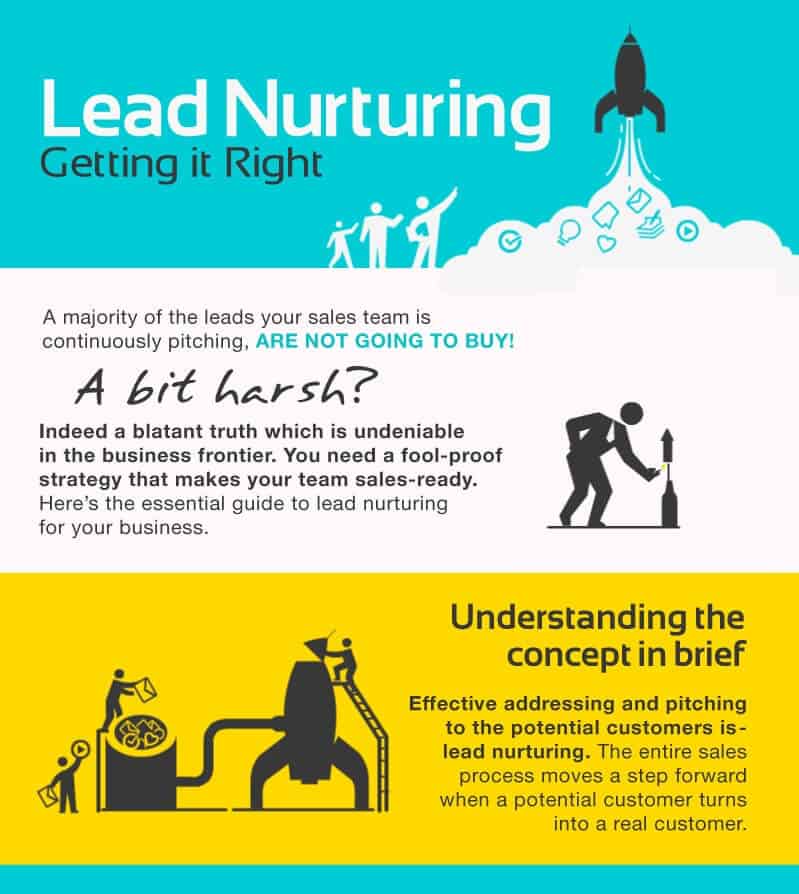
Although this infographic uses a limited palette, the color is eye-popping, and the animated elements keep it engaging. This infographic is very informative. Each section has a descriptive header supported by relevant statistics, examples, and actionable tips. Text is expertly balanced by graphic components, making it an attractive and valuable visual on the topic.
90. Orchestrate a Solid ABM Team
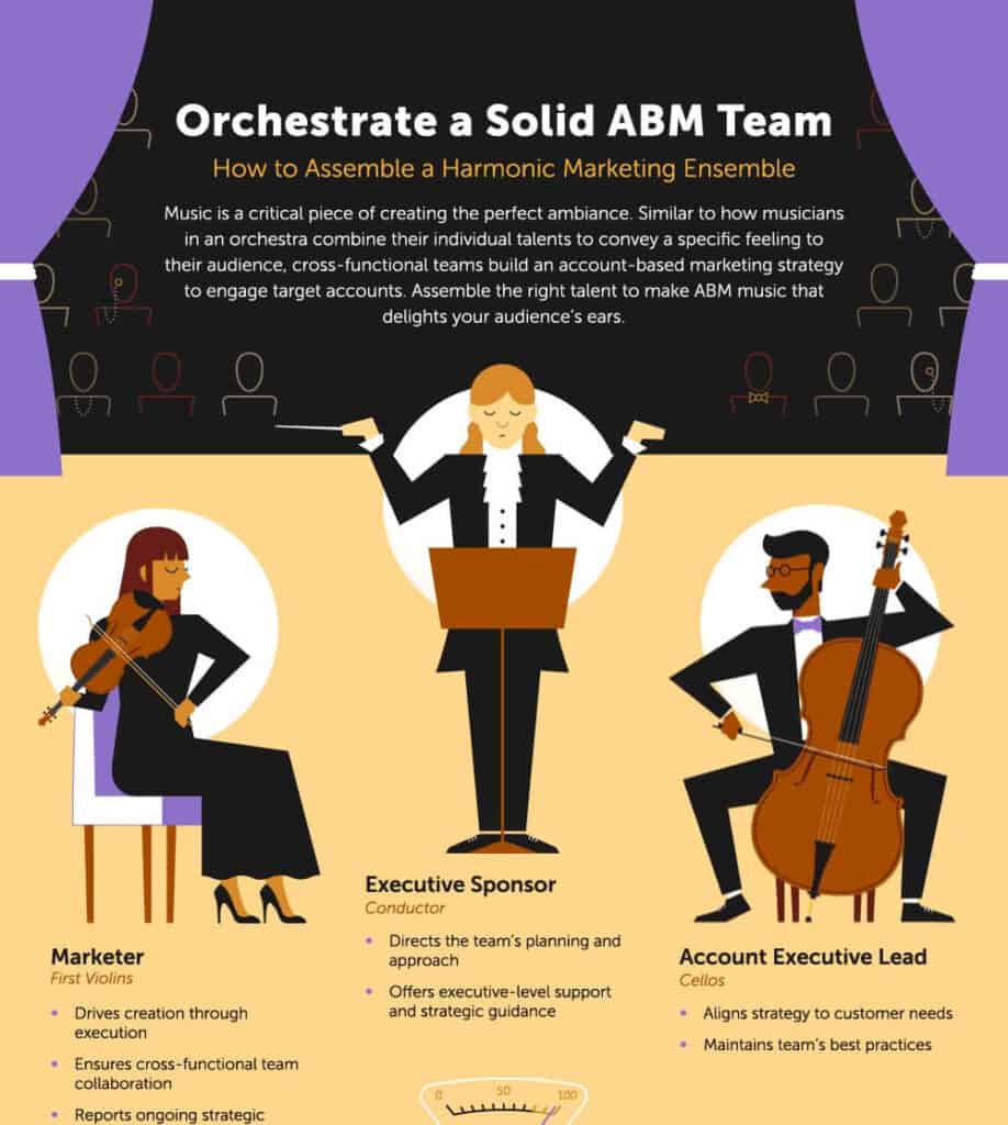
It’s a beautifully designed analogical infographic comparing an ABM team to a well-synchronized orchestra. The title, subtitle, headers and words, all adhere to this analogy and list the crucial roles performed by each position holder. In the end, we can see a CTA offering Marketo services to their audience.
91. Construction Exoskeletons
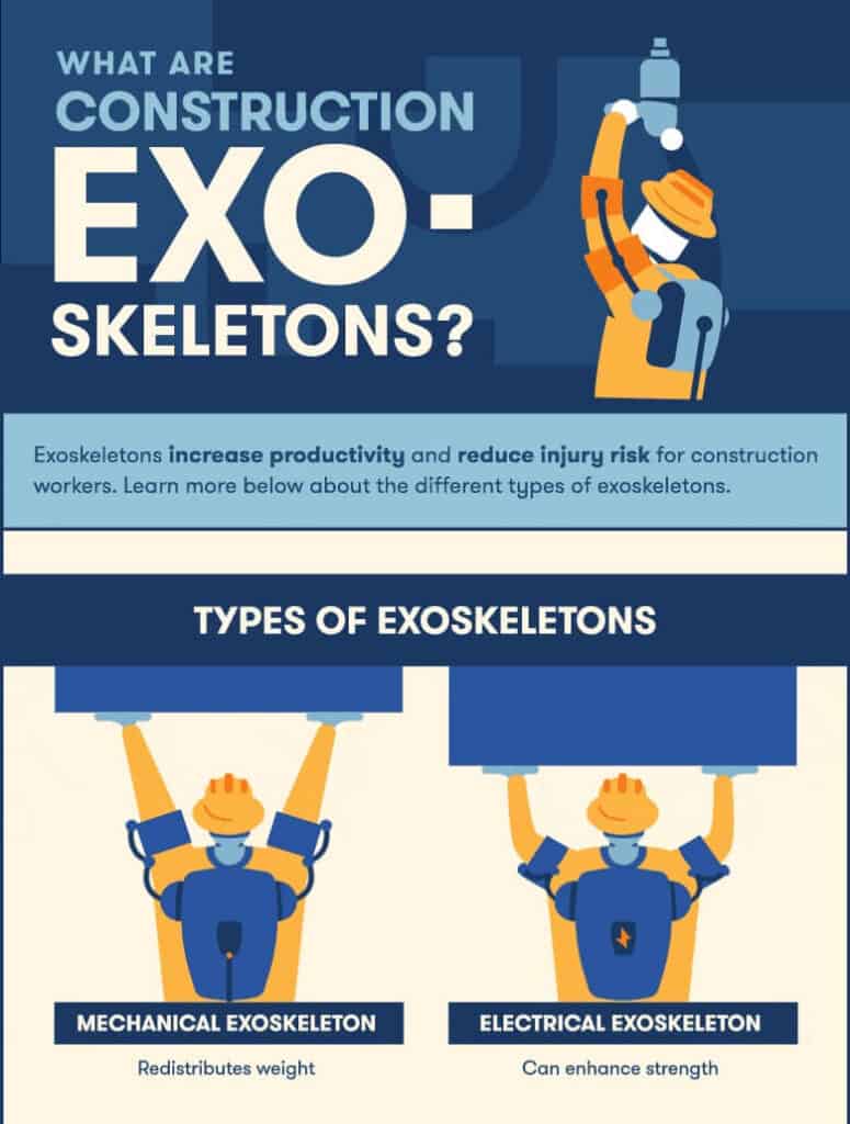
It’s another stunning and informative visual by Big Rentz that is spot-on for their target audience. The design and color choice is simple, and they have used minimal words to get their message across. The automated graphic elements play a key role in this infographic and make an excellent example of how even subtle automation can make a prominent difference. This infographic has 44 backlinks from 22 referring domains.
Guides
These infographics are a complete yet concise resource on any given topic. They are typically very long and comprehensive, with many segments to cover a topic thoroughly. A study shows that visuals can increase learning and information retention by 78%. You can create them to accompany expert guides or publish them as a standalone piece for quick references.
92. Guide to Youtube Marketing
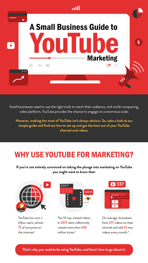
One of the clever things about this infographic is the use of Youtube’s branded red and white colors. Any user interested in YouTube marketing will want to download and share this infographic because it has all the information one may need on the subject.
This infographic is truly a beast! All the explanations, examples, and tips are concise, to-the-point, actionable, and supported by relevant statistics. The information is divided into logical sections though the background is kept white for the most part. The illustrations complement the text and red boxes highlight pro tips and vital points.
93. Dog Poop 101
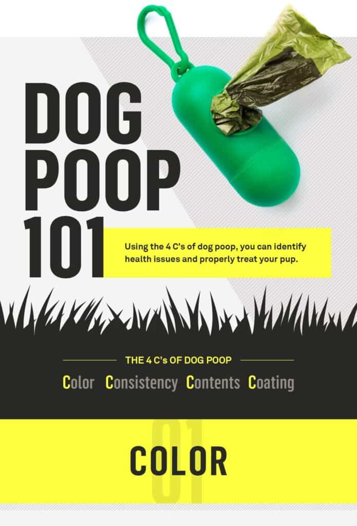
The infographic topic is quite relevant to Gallant’s target audience, i.e., the pet parents. This is a simple and to-the-point guide on dog poop and how pet owners can identify if it’s normal or they need to call in a vet. The color chart, along with text captions, is extremely helpful and can serve as a cheat sheet to match dog poop colors for reference. This simple infographic has been linked 25 times by 19 referring domains.
94. Sleep With Your Dog
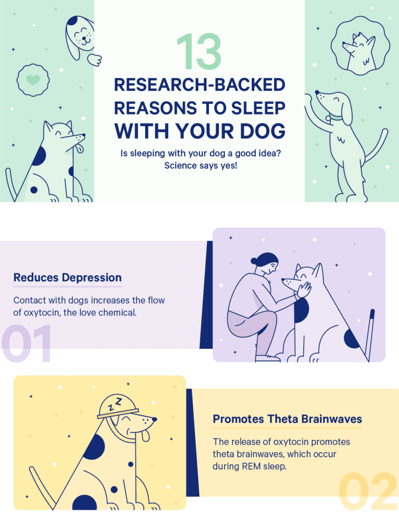
This is yet another Casper infographic in its branded soft pastel colors. It has fun illustrations, cute dogs, and engaging text. The title boasts research-based reasons, and in the text, we can see statistics and names of credible institutes to prove their claim. It’s a simple yet effective infographic with 146 backlinks and 70 referring domains.
95. Outsourcing for Startups
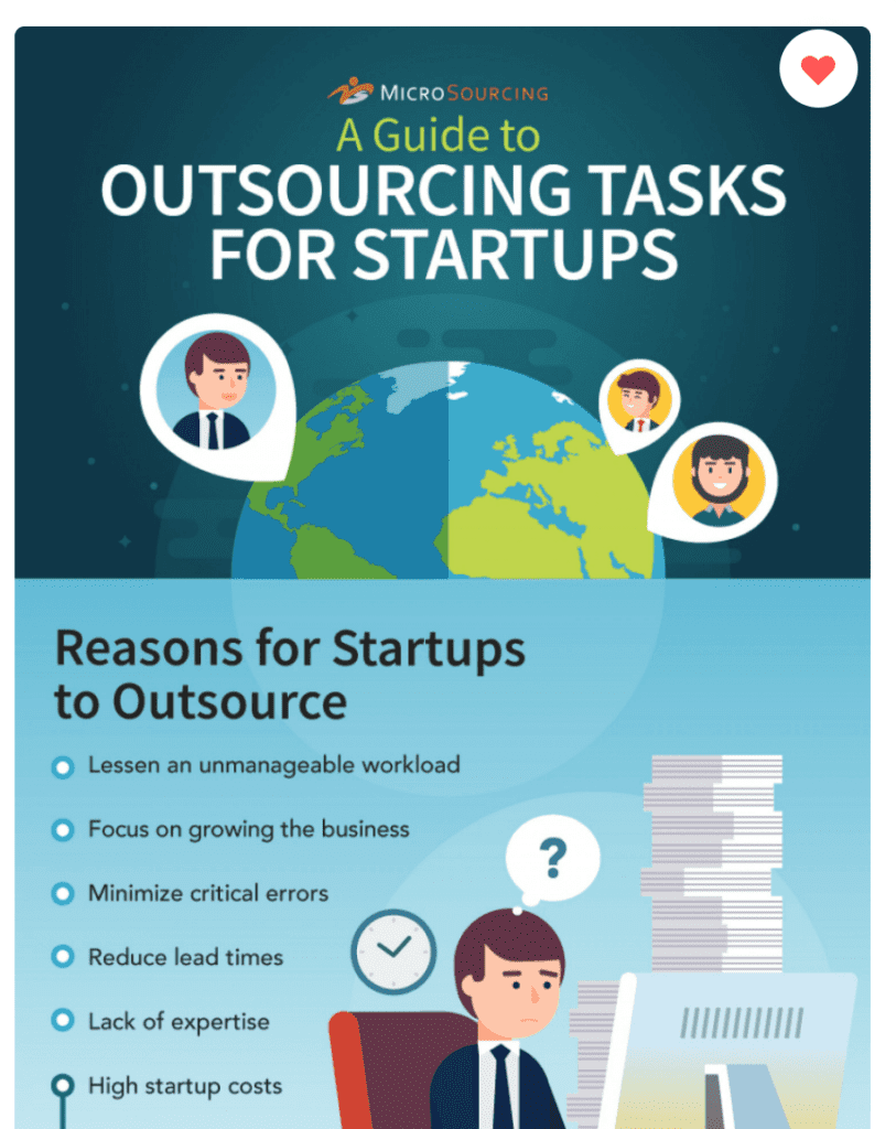
This infographic perfectly sums up the reasons, benefits, and areas that can be outsourced in the most concise manner. It’s a colorful visual with a contrasting color scheme and a handy Things to Remember note for a final takeaway, followed by a CTA to offer their services to their audience.
96. American Food Deserts
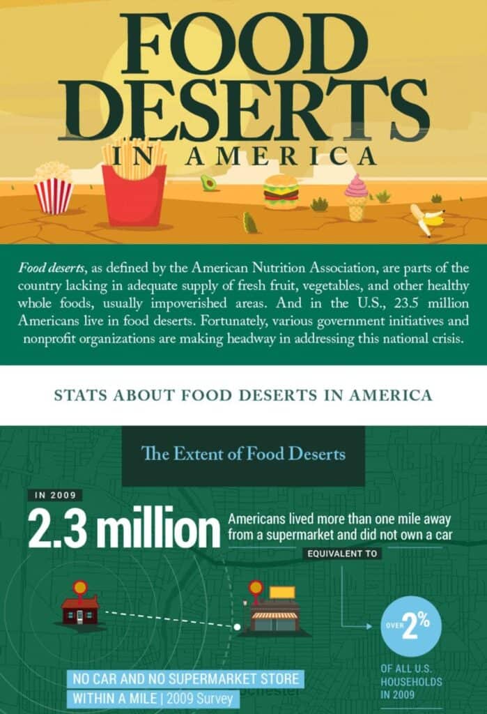
Based on the idea of food deserts in America, this infographic has attracted 356 backlinks and 173 referring domains to Tulane University’s School of Social Work. It presents exciting data and facts about food shortage across America, its effects on health and initiatives to improve the situation.
Overall, the designer has chosen a dark palette for this infographic. We can see statistics, research results, actionable tips, and valuable tools suggested in the explanations. Every point is supported by relevant images, maps, tables, and other relevant graphical elements.
97. Harmful Effects of Sugar
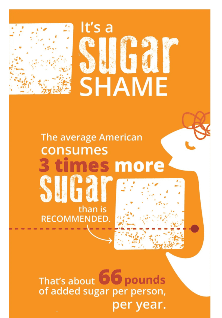
Starting with statistics, moving on to the harmful effects of sugar, and ending with ways people can avoid it, Healthline has expertly summed up the hazards of sugar consumption in this stunning infographic. All facts are based on research and studies and are supported by statistics. Similarly, all the tips and instructions are actionable and easy to understand.
The infographic is designed in a way to pull the gaze of the reader downwards. This keeps the readers engaged and encourages them to heed the advice.
98. Deadly Snake Guide
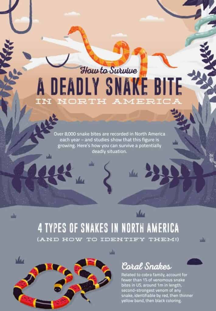
With a mute pastel background, the colors of the different types of snakes make the infographic stand out to the reader. Each snake has a clear description of its identification, where it may be found, and how dangerous it can be.
The framing around the ‘If Bitten’ section centers all attention and draws the eye to the life-saving instructions below. These instructions are simple, direct, and to the point. They didn’t even need to use large arrows or texts, the colors and the sectioning do the work while keeping the design minimal. This snake infographic will undoubtedly save lives. It has been linked 61 times from 44 referring domains.
99. Wedding Venues
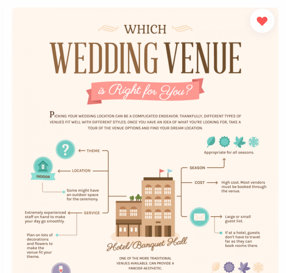
This is an excellent resource for all the different wedding venues you can choose from. The crucial information about each venue, which can and should affect decision-making, is presented in a simple way and color-coded for visual impact. Text and illustrations are minimal, and still, this infographic holds a lot of crucial information. The audience can just take a quick look, match it to their preferences, and know what venue suits them.
100. Electronic Waste
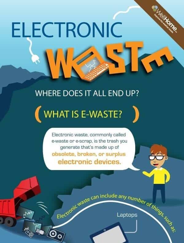
This is a detailed infographic about electronic waste and where it ends up. It packs in a ton of information, starting from what e-waste is and where it originates. There are interesting facts backed by shocking statistics that make the infographic engaging and also showcase the enormity of the situation.
However, the text and the design aim to keep the information easy to understand. Moreover, the bright, contrasting colors and relevant graphic elements don’t let the data overwhelm the viewers.
101. Bedtime Yoga
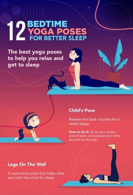
It’s a simple infographic that serves as a complete guide to yoga poses that aid sleep. Simple words and supporting illustrations make it a quick reference point to practice bedtime yoga every night. The instructions not only provide actionable steps to perform it but also explains the benefit of each pose. The infographic ends with a CTA and a link to the source website, which brings in traffic and organic backlinks as well.
102. Deep Web
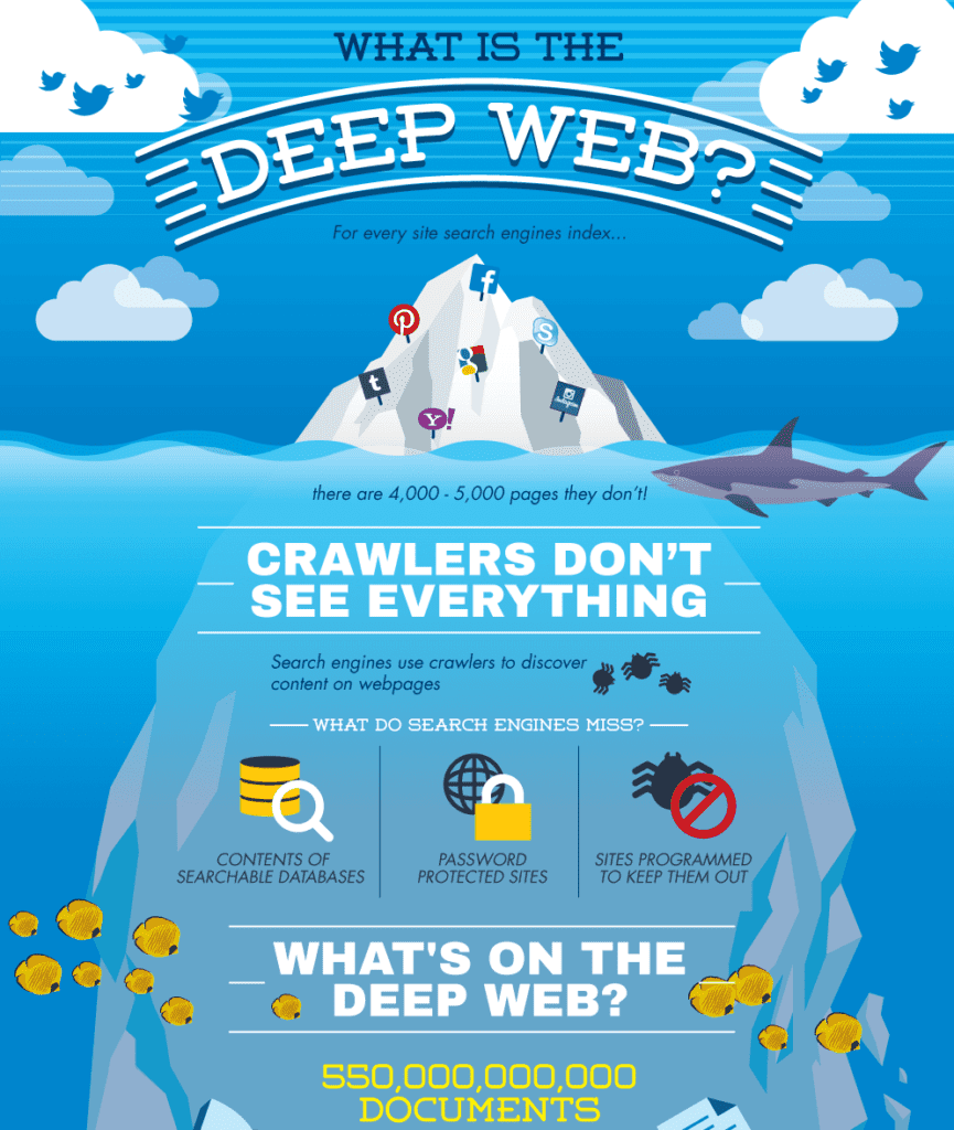
Contrary to the topic at hand, this infographic uses bright colors and beautiful shades of blue with cute illustrations of aquatic animals. From the glacier tip to the deep waters, the analogy does a good image play with the Deep Web. Although it’s a complex, somewhat dark subject matter, this infographic does a good job keeping things light and casual and still manages to relay all the essential information about the Dark Web.
103. Hipsters Guide to ROI Acronyms
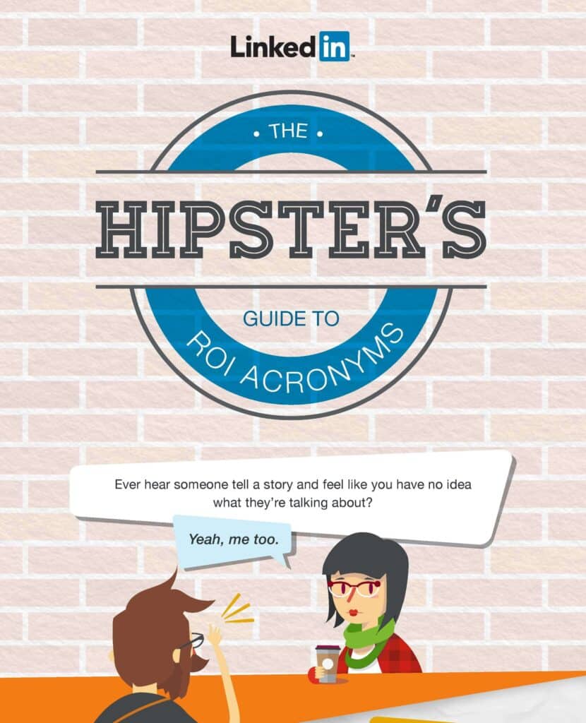
LinkedIn has used the word Hipsters as an analogy for new marketers entering the field. The infographic hooks the audience right in through the power of storytelling and keeps playing upon the theme by using vectors of stereotypical hipsters of different types—points for that.
The light-hearted vibe balances the dryness of the subject, i.e., making people familiar with ROI terms. Each term has been explained in the most concise and simple way and supported by a relevant illustration. Notice the reasonably persuasive text before the final CTA and link to the LinkedIn guide.
104. Texas Winter Storm
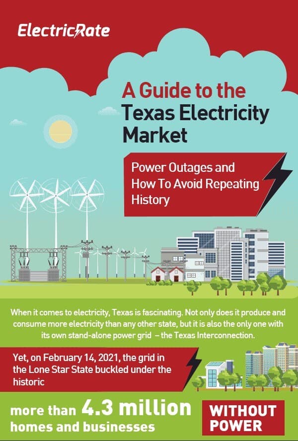
This infographic packs in everything you need to know about the Texas energy market and steps being taken and should be taken to minimize power outages. Some parts of this infographic are text-heavy; huge graphics, charts, graphs, and animated elements in other sections balance them perfectly. When there’s a lot of information to relay in a limited space, sometimes you have to give the text more space than the graphics.
105. Meditate Every Day
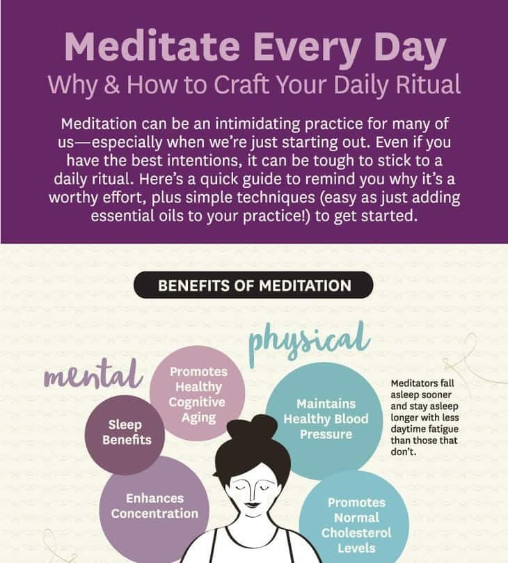
Yoga Journal has made it extremely easy to digest the information by color-coding the benefits and breaking it into sections. The infographic highlights the benefits of meditation in clear and prominent text bubbles. It also summarizes the physical, mental, and emotional benefits of meditation before moving on to the next section.
The 5-step Daily Ritual Meditation can quickly get the readers started, and the 3-step metta meditation is an excellent addition for setting the intentions right. All instructions are actionable and easy to follow. Soft colors and neutral background set the right mood for this meditation infographic.
The one major takeaway from these outstanding infographic examples is that the best infographic isn’t just pretty images thrown together with a bunch of text. The best-performing infographic that gets the most backlinks and shares are the ones that pack in a lot of actionable information for the readers.
The huge informational potential of the infographic is quite evident from the infographic examples discussed above. If done right, infographics can not only boost your organic traffic and improve organic shares but also attract a large number of backlinks, improving your ranking and ROI. Choose the topics that fit your marketing strategy and inspire your target audience to gain maximum traction from your infographics.
Karli is content marketing consultant behind Wild Idea, a content marketing and SEO collective focused on driving big results. With over 12 years in the marketing industry, she’s worked with brands large and small across many industries to grow organic traffic and reach new audiences. She writes on everything from marketing, social, and SEO to travel and real estate. On the weekends, she loves to explore new places, enjoy the outdoors and have a glass or two of vino!


